
by Bookworm Mama | Feb 14, 2018 | Book News, Cover Designs
Today is a very special day!
Not JUST because it is Valentine’s Day…Although that is a pretty grand reason to celebrate.
Today, we are celebrating the cover reveal for An Hour Unspent, book 3 in my Shadows Over England series.
I am so grateful to the entire team at Bethany House for the dedication and thought that they have put into every cover in this series. An Hour Unspent was no exception…and this cover truly made me giddy when I first saw it…Ok, it STILL makes me giddy.
First…A little about the book…
Once London’s top thief, Barclay Pearce has turned his back on his life of crime and now uses his skills for a nation at war. But not until he rescues a clockmaker’s daughter from a mugging does he begin to wonder what his future might hold.
Evelina Manning has constantly fought for independence but she certainly never meant for it to inspire her fiancé to end the engagement and enlist in the army. When the intriguing man who saved her returns to the Manning residence to study clockwork repair with her father, she can’t help being interested. But she soon learns that nothing with Barclay Pearce is as simple as it seems.
As 1915 England plunges ever deeper into war, the work of an ingenious clockmaker may give England an unbeatable military edge—and Germany realizes it as well. Evelina’s father soon finds his whole family in danger—and it may just take a reformed thief to steal the time they need to escape it.
Are you intrigued yet? If you have read the first two books in the series, you will know that Barclay and his “family” are a bit unconventional and fiercely loyal. I am so glad that I have had the opportunity to introduce them to you.
Now, are you ready?
…Drum roll please….
…I give you….
…The cover…
…of…
An Hour Unspent
Keep an eye on the website for more pre-order options as they become available!
I absolutely love that inside-the-clock view! When my editor told me they’d be doing that, I was super excited, and I adore how it turned out. So unique! Such an interesting perspective! And featuring the daughter of my fictional clockmaker who tends to the clock in Big Ben…perfect. =)
I can not wait for you to read Barclay’s story, which will be releasing in September! In the mean time, how about a little GIVEAWAY to tide you over until then?
I am giving away the FIRST two books in the series to ONE lucky winner. Please enter the giveaway via the Rafflecopter form below. Giveaway will end 2/21/18 at 11:59pm EST. Open to U.S. mailing addresses only. Void where prohibited.

by Roseanna White | Jan 24, 2018 | Books, Cover Designs
Time for another peek behind the cover design process! This time, I’m featuring one that won’t be all that involved. As designs go, it was pretty simple. Which is why I’m featuring it today, as I’m short on time. 😉
Rachel McMillan is best known for her historicals, but she occasionally puts on a contemporary novella, and I’m always thrilled when she comes to me for the cover. =) Last year I designed a cover for a Christmas novella duo in which she and Allison Pittman each wrote a story.
This year, Rachel has Love in Three Quarter Time releasing on Valentine’s Day.
Her wants were pretty simple. The heroine, face not visible, and Vienna in the background. She gave me some great photos for inspiration and even the name of a few buildings she’d like to see on the cover. And as a comparable cover, she recommended this (and other covers for Carla Laureano):
Armed with nice, decisive information like this, I hit Shutterstock with confidence. It’s always so much easier to design a cover when the author knows exactly what they want!
My first hunt was for a model that fit the description of Rachel’s main character. Rachel described her as having shoulder length dark hair, cut in a curly bob. She tends to wear turtleneck sweaters, knee high boots, tweed, cardigans…”classic librarian.” I went searching for such lovely ladies with their faces averted and happened pretty quickly upon this one.
Not bad! Happy with that as a starting place for Evelyn, I next turned to images of Vienna. Anything from historical Vienna would do, but I began by looking for images of the Staatsoper (opera house), upon Rachel’s recommendation. And there were some GORGEOUS photos of this building at sunset. This is the one that caught my eye.
Putting the two together was pretty simple. The only real tweaks I had to make were to delete a few flyaway hairs and add some lighting to the model, which gave me this.
I wanted to punch the lighting up a little bit though, so I added the Hudson filter…
Satisfied that this was a good base, I added some faded color layers to give me a good place for the words…
And then added the title and author. Now, I’d just purchased this super-gorgeous font called Monstera that I was dying to use…especially since I’d FINALLY figured out how to access all the pretty alternates (I’m embarrassed by how long it took me to actually read the how-to included with all these fonts I’ve downloaded. For reference, on a PC, hit the Start button and type “Character Map.” Click on that, and up will pop a screen like this…
Just click on the version of the letter you like, click Select, and then Copy, and paste directly into where you want to use it–in my case, the text layer in Photoshop. Ridiculously simple.)
So as you can see in the image above, I played around with the various forms of each letter until I landed on this.
This was almost, almost there. But I wanted a little something more. A flourish. Something to pull the music theme of the title (Vienna is where the waltz originated) into the cover. So I found this pretty little musical flourish…
I put my choice of this set behind the title, and it added just the touch I was looking for! I showed it to Rachel, and she declared it exactly what she was looking for. Yay! So here’s the final:
So here’s some more about the story.
A romantic waltz through a city filled with music, passion and coffee.
Evelyn
Watt fell in love with Austrian marketing director Rudy Moser the
moment he stepped into their Boston firm. With his ice blue eyes and
chocolate-melting accent, he is as refined as she imagines his home
country to be. When Evelyn finds herself unexpectedly unemployed right
before Christmas, she is left with an unknown future until Rudy steps in
with a job appraising, assessing and cataloging heirlooms, lending her
American vernacular to the translated descriptions to give each item
international appeal. Evelyn will live in Vienna for the months leading
up to a grand auction at a party held in conjunction with the Opera
Ball—on Valentine’s Day.
Vienna is a magical blend of waltzing,
antiques, and bottomless cups of Einspanner coffee at the Café Mozart.
When a secret from Rudy’s family’s past blows in with the winter chill,
Evelyn is forced to confront how well she knows the object of her
affection. Her café tablemate, the gruff and enigmatic Klaus Bauner
might be the only person who holds the key to Rudy’s past. But could
that key also unlock her future? In the days leading up to the Opera
Ball, Evelyn finds herself in the middle of the greatest romance of her
life…as long as she doesn’t trip over her two left feet.
You can pre-order this from Amazon now, and it’ll download to your Kindle on 2/14!
What do you think of the cover? Do you like the feel? The setting, the face-averted heroine?

by Roseanna White | Sep 27, 2017 | Books, Cover Designs
It’s been a while since I’ve gone behind the design of a book cover…and since someone asked me about it last week, I figure it’s time for another example. But what cover should I feature?? Always a question–and since I can’t always release a cover publicly when I design it (gotta wait for the author to do so, after all), I’m not always sure when I can feature a cover.
But in this case, there’s no question as (a) it’s a WhiteFire book and (b) it releases October 15! So today we’re going to take a look at Melody Carlson’s String of Pearls, the third book in the Mulligan Sisters Series.
Let’s start by looking at the first two books in the series.
As you can see, we have a theme established for the series. In the foreground we have one of the sisters–starting with Bridget, who joins the Army Nursing Service at the beginning of WWII, and then moving to Colleen in book 2, whose dreams get all tangled up in heartache as she pursues a Hollywood career. In the background of each book, I used a public domain era photograph which I colorized.
On book 3, we knew we wanted Molly, the youngest of the 4 Mulligan sisters. Molly looks a lot like Colleen, so my first challenge was going to be finding a model who could look like the sister of #2. I tried a few different girls but ended up using this one.
Of course, the body wasn’t right–but I liked the face. She bears a nice resemblance to the model for Colleen, coloring’s right, and I loved her smile. And I had already scoped out an image of a 40s style woman with a camera–and Molly loved photography.
I started by just putting the blond’s head as-is on the brunette’s body, but Melody requested some more 40s style hair. So I took this lovely lady’s curls…
Lightened and brightened them, put them on the first blonde’s head, and plunked them both on the brunette’s body, to get this.
But I didn’t want to keep the same coloring on the clothes–especially since I’d recently used another shot of the brunette in a different cover and preserved that red sweater in that one. Here, I decided to go with blue. So I copied the sweater and the skirt, made them new layers, and used the Hue/Saturation option to change them to blue.
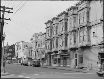
But what to use as a backdrop? I tried a few modern photographs behind her–shots of San Francisco streets. But modern photographs just don’t look the same as 1940s photographs, and it gave the cover a whole different feel from the first two books. So I went hunting for photos I could use from the 1940s and eventually found this one.
The only problem with this is that it was going the wrong direction–I needed my lines pointing at my model, not away from her, in order to balance the image correctly. Now, flipping an image is easy-peasy…until you realize that there are signs which are then backwards. *Sigh*. But I just flipped and resized all of those as well.
Then the tricky part–colorizing it. This isn’t my forte, but I’ve been learning how to do it. In general, the method is to create a new layer, set said new layer to a different blending mode–often Overlay, though occasionally a different option works better, just depending on the color being used.
Now, I didn’t bother colorizing the whole photo, just the part visible behind Molly. So it looks a little funny like this, LOL.
I referred to the modern photos of this street to get some color inspiration for the houses, and chose red for the car because it would show up nicely against the dark tones of the black and white photo, and also provide a little pop of color.
Of course, we needed a beautiful sky. Each of the first two books had very bold, rich skies. So I searched for a photo of San Francisco with a gorgeous sunset sky and found this one.
So putting that behind the blank sky of the city, and it all behind Molly, we arrive at our basic design.
The title and series were already designed, so it was a pretty simple matter of plugging those in and adding some shading behind them to make everything stand out. I chose red for the title, echoing that pop of it from the car and the sign. My final step was to add a photo filter action to draw it all together and add a bit more depth to the colors. In this one, I used X-Pro (a filter Instagramers will recognize.) And there we have the finished cover!
So what do you think? Do you like the style that mixes old photos with new? Do you have a favorite from the series?
And if you’re a Melody Carlson fan, definitely go snatch these up! They’re a really interesting look at WWII through a family on the home front.

by Roseanna White | Aug 9, 2017 | Books, Cover Designs
Are you a member of the Band of Booksters yet?
If so, you get to vote today on new cover choices. If not . . . sign up here, request to be added to our Facebook group so you can chat with this amazing team of book lovers. THEN cast your vote. 😉
Today’s survey is deciding between two new styles for WhiteFire’s first series. When Shadowed in Silk first released, thumbnail images weren’t quite the King of Sales they are now (or at least, we didn’t realize they were). Now that we know how important it is for title and author to be legible in that small size, we’re giving the books in the series a facelift.
Remember these award-winning books?
We’ve come up with two new options for them. The first keeps the same models, but fades their face only into an Indian background.
The second version doesn’t use photographs at all, but rather goes with a graphic style that focuses on the title and the color–choosing colors to correlate with the originals.
I won’t be posting much more from the Band of Booksters on my blog, but as it’s still so new, I want to give you a peek at what sort of thing you can expect, if you haven’t signed up already. 😉 And if you have but didn’t receive our newsletters last week, then check your spam folders and add us to your approved list! We’d love to have you join us on Facebook, where the discussions are already great.
Already a member, or have just requested to join? Then cast your vote for the covers!

by Roseanna White | Jun 7, 2017 | Book News, Cover Designs, Word of the Week
It’s always so exciting to get to share a new cover with you!! And I recently received the art for A Song Unheard, so here we go!
First, a bit of background. Where book 1 in the series features a library and books [insert blissful sigh here], my hero and heroine in A Song Unheard are both violinists, so obviously we needed a violin on the cover. That was non-negotiable. 😉 We also needed:
- A girl in her 20s with light brown hair that slips from its chignon when she plays (I gave them Emily Blunt as my inspiration)
- 1914 styling
- A midday room, since all the playing happens in a hotel’s function room, not on a stage
- A bit of mystery 😉
As always, Bethany House did a great job finding a model that fit my description and finding a unique way to put a violin in her hands! Are you ready?
3
. . .
2
. . .
1
. . .
Voila!
I love the soft, warm colors of this cover, and the art deco accents–similar to but different than the ones used on A Name Unknown. And you can just tell from the expression on her face that it’s not the music stand she’s set on watching, can’t you? Yes, this is a woman with an ulterior motive for sure!
Now for the blurb:
Willa Forsythe is both a violin prodigy and top-notch thief, which makes
her the perfect choice for a crucial task at the outset of World War
I–to steal a cypher from a famous violinist currently in Wales.
Lukas
De Wilde has enjoyed the life of fame he’s won–until now, when being
recognized nearly gets him killed. Everyone wants the key to his
father’s work as a cryptologist. And Lukas fears that his mother and
sister, who have vanished in the wake of the German invasion of Belgium,
will pay the price. The only light he finds is meeting the intriguing
Willa Forsythe.
But danger presses in from every side, and Willa
knows what Lukas doesn’t–that she must betray him and find that cypher,
or her own family will pay the price as surely as his has.
Now, for fun, side by side with the first book…
So what do you think? Favorite part of the new cover? How do you think it works with/compares to the first one?

by Roseanna White | Jan 12, 2017 | Cover Designs
I’m up to my eyeballs in galleys for A Name Unknown right now, so I can’t spend much time on the ol’ blog this week. But I did want to check in real quick. So I thought I’d do a quick share of the covers I created last week.
WhiteFire just acquired some of Melody Carlson’s backlist contemporary titles–all previously published, but we’re giving them a fresh new look. I’ve had fun repackaging these MC classics, and since the first batch of them are processing and will be available today/tomorrow (I’ll update with links later), I figured it would be cool to share!
I tackled them in an, ahem, amazingly brilliant order. Alphabetical. 😉 So here they are in that same order.
First up is actually the most recent of the books, Armando’s Treasure
Dora Chase is an eighty-year-old widow whose
family finds her frustratingly independent. Her son no longer trusts her
judgment and constantly pressures her to sell her rural home and rundown farm
to a huge computer firm.
When a young stranger shows up, Dora is
suspicious, but before long Armando Garcia wins her trust. And Armando supports
Dora’s independence, causing the conflict within her bickering family to
escalate. Dora’s son abhors Armando’s interference and is determined to send
him away. He suspects the charming young man is running from something or
someone. And he’s not far from wrong.
The unlikely friendship that grows between the
elderly widow and the young man with a past leads them both on a journey toward
hope, healing and forgiveness.
Going on that description and the previous covers, both of which had a classic Chevy truck in blue and some sunflowers…
I came up with this.
Melody approved, so it was on to the next, Built with Love, which had been originally published as Wise Man’s House.
For a young widow, the stone mansion she once
dreamed of owning, offers the promise of a new beginning.
After the death of her husband, Kestra returns
to her hometown of Port Star. With the purchase of her childhood dream house—a
stone mansion along the rocky Oregon coast—it appears she has found a way to
rebuild her life.
Kestra begins to transform the old house into an
elegant, yet charming restaurant. But as the renovations begin, a mysterious stranger
moves into her caretaker’s cottage—and eventually into her heart.
Suddenly life is full of promise and new opportunities,
until a contractor’s jealousy threatens Kestra’s new romance.
The opening of this one had some nice mood to it that I wanted to capture. So again, armed with the blurb, my glance at the first pages, and these previous covers…
I came up with this.
My original had a larger house–I apparently think in East Coast terms, LOL–but after some minor tweaking anyway… 😉
Next up is Heartland Skies.
Jayne
Morgan has a lot to learn about love. Harris McAllister has a lot to learn
about tolerance. When they meet they have lots to teach each other.
Jayne
feels betrayed when her fiancé suddenly
dumps her for his high school sweetheart just weeks before the wedding. She’d
love to leave Paradise, Oregon, but she’s signed a teaching contract and the
kids in her classroom need her.
This one was Xoe’s favorite–because HORSES. 😉 I had the saddle wrong in my first attempt, not realizing she rode English instead of Western, but after a bit of tweaking, we went from these…
to this:
The next one is a bit different. Looking for Cassandra Jane is a coming-of-age story set in the 60s and 70s. So I wanted it to have a different sort of look to capture that young feel, and also the era.
Cassanda Maxwell has had a life filled with
pain. Her mother died too young, her father is an abusive alcoholic, and she’s
a misfit everywhere she goes.
After being shuttled between various foster
homes, Cass struggles to find her identity and finds herself caught up with
Scott Jones (aka “Sky”) and his group of friends who start a Jesus commune in
California. But before long, the group is more interested in pot and sex than
they are spiritual growth.
Once again, Cass finds herself trapped in
unhappiness—and she longs for escape.
Will Cass find the life and love she craves on a
California commune—with the charismatic Sky and his followers? Or
can she fulfill her dreams—and find her real future—with her childhood
friend Joey?
I quite liked the original cover–the distressed feel of it and the girl hanging her head.
I didn’t imitate it exactly by any means, but that’s what I kept in mind as I hunted up photos. I was afraid Melody and her agent wouldn’t get my vision with the big script font, LOL, but they both loved this.
Then we had Shades of Light. I read a few chapters of this one as I prepared myself to design it and was quite enjoying the theme of light–physical and metaphorical.
First there are shades of sorrow, then shades of
hope. Will Gwen find shades of light?
When her only child leaves home for college,
widowed Gwen Sullivan discovers just how lonely an “empty nest” can be. How
will she adjust and fill her empty days?
At the urging of friends, Gwen takes a job with
an interior designer—whom she soon discovers to be domineering and jealous of
Gwen’s creativity. Suddenly she’s stuck doing menial tasks. When a sleazy client
starts to harass her, Gwen begins to wonder if she’s cut out for the working
world.
She eventually meets Oliver Black, who gives her
an opportunity to use her decorating skills, and suddenly Gwen sees herself in
a more confident light. But Oliver is a man of many secrets, and Gwen wonders
if she can trust her heart to him.
Light is crucial to the main character, so I wanted a cover where she’s bathed in it. I found a model of the right age at a window, inserted a Pacific Northwest background (very faintly), and voila.
Melody loved the expression on her face here, so we had a winner!
And finally, the one with the absolute best setting. 😉 Previously titled Awakening Heart, we retitled this one with Melody’s original working title, Thursday’s Child.
Emma has always been “the practical one” in the
family. But that is about to change as she embarks on the adventure of her
life.
Emma Davis wants a new life now that she no
longer needs to care for her grandmother. A spur-of-the-moment visit to a
travel agency sets her on a journey far from her Iowa home.
Emma takes a cruise to the far islands of the
Pacific, but it isn’t until she arrives in Papua, New Guinea, that she begins
to realize her true calling. Emma regains her sense of purpose by caring for
three motherless children and befriending their father, Josh Daniels.
Josh’s troubled pass and
the loss of his wife have left him vulnerable, but can the love Emma has
discovered in her own heart, awaken his heart to all Emma has to offer?
But I wanted to capture that gorgeous setting!
So there we have it! I still have four more covers to design for a series from Melody that we’ll be re-releasing, but that will have to wait until after galleys. Speaking of which . . . BYE!


 Roseanna M. White is a bestselling, Christy Award winning author who has long claimed that words are the air she breathes. Having successfully launched two homeschool grads, she now spends her time writing fiction, designing book covers, and pretending her house will clean itself. Roseanna is the author of a slew of historical novels that span several continents and thousands of years, as well as a fantasy series and contemporary mysteries and romances. Spies and war and mayhem always seem to find their way into her books…to offset her real life, which is blessedly ordinary.