
by Bookworm Mama | Oct 10, 2018 | Book News, Cover Designs
It’s that time again!
I confess: seeing my covers is one of the most exciting parts of the whole book-creation process. I mean, I love writing the story. And holding it in my hands for the first time can’t be beat. But getting that first glimpse of a story’s face? Yeah. That’s pure awesomeness right there.
And though
An Hour Unspent only released a month ago, I’m already fully immersed in my next series, The Codebreakers. If you’ve read
A Song Unheard, then you’re hopefully (LOL) already a fan of this next heroine.
Margot De Wilde, little sister of Lukas, takes center stage, all grown up and helping England with her cryptography skills in the mysterious Room 40, intelligence hub of the British Admiralty. Haven’t read Shadows Over England yet? No worries–characters they have in common will just appear like secondary characters, and it won’t be assumed that you’re already familiar with them. 😉 But if you the Ladies of the Manor series, you’ll be excited to know that
those characters appear too! Brook actually spurs
Margot into a rather funny decision… Anyway!
So, bit of backstory on the cover. On my birthday (August 14) I got an email from my editor that wished me a happy birthday and said they’d actually just wrapped the cover photo shoot a few minutes ago, so he sent me a candid shot from it. Best. Gift. Ever. It was fun to see the set they used (which involved a window set up on blocks and held upright with a clamp) and the model they’d chosen. Aaaaggghhhhhh!!!!!!! That glimpse was enough to know I was going to love the final product.
Then a few weeks later, I saw the cover itself. Oh yes. Total LOVE. It was EXACTLY what I’d asked for. Margot, at an old window, foggy rain beyond it. Writing the number 18 on the glass with a finger. Wearing a long, belted cardigan, hair in waves. Bethany House always does an amazing job on my covers, but this is the first time that my exact suggestion was used, so it made me all the more excited.
So are you ready???? Here it is!
Isn’t it gorgeous??? I love the model they chose–she definitely has that European look that Belgian
Margot should have. The expression on her face is
perfect. I adore the red of the cardigan–in the story originally it was blue, but I promptly changed it to match, LOL, as we all agreed this color was perfect for the cover. The art deco touches and font is spot-on, and that 18 she’s writing on the window…
What’s the significance of that? Well, you’ll just have to read it in June and find out. 😉 Though, funny story. I showed the cover to one of my writing partners, and she loved it. Then read the manuscript that weekend and had to come back with a thrilled email of “THEY PUT 18 ON THE COVER!!!!” A detail that doesn’t mean a whole lot until you read the story. And then it means everything. 😉
Here’s a bit more about the book:
Three years into the Great War, England’s greatest asset is
their intelligence network—field agents risking their lives to gather
information, and codebreakers able to crack every German telegram.
Margot De
Wilde thrives in the environment of the secretive Room 40, where she spends her
days deciphering intercepted messages. But when her world is turned upside down
by an unexpected loss, for the first time in her life numbers aren’t enough.
Drake Elton returns wounded from the field, followed by an
enemy that just won’t give up. He’s smitten quickly by the too-intelligent
Margot, but how to convince a girl who lives entirely in her mind that
sometimes life’s answers lie in the heart?
Amidst biological warfare, encrypted letters, and a German
spy who wants to destroy not just them, but others they love,
Margot and Drake
will have to work together to save them all from the very secrets that brought
them together.
(other retailers not yet available)
What do you think of the cover? Do you like the mood? Do you find the image intriguing? Make you wonder about that message on the glass? What’s your favorite part?

by Roseanna White | Jun 20, 2018 | Cover Designs
Sometimes authors come to me with very little idea of what they envision for their cover…and other times, they know exactly what they want. Now, knowing exactly what they want can occasionally be difficult, if that “what” is complicated. 😉 But other times, it makes it oh so easy to deliver a cover they love, quickly.
Pepper Basham has come to me several times with a very clear, very doable idea of what her next cover should be–she’s done several herself, and she has a great eye for what works. Occasionally she just needs me to handle some of the details.
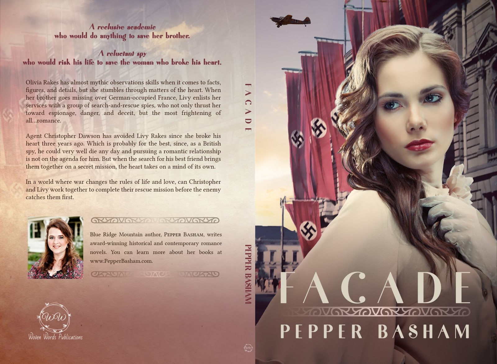
Such was the case for her WWII novella, Facade.
She knew exactly what she wanted. This model…
…over this background.
Pretty simple. So arranging that and sizing it correctly, we have this.
Not bad from the get-go, right? But Pepper hired me to punch it up a notch, so I figured I’d get punching. ? A quick one-two. First, I traded out that blue sky for something a little more interesting–a bit of sunset, golden flare.
Then, of course, I had to tweak the model’s coloring and brightness to match.
There was also a little bit of fine-tuning in there. The background image is an original WWII image, so it’s a bit grainy. I put a surface blur on it to smooth it out and then fooled with the highlights a bit to reflect my new sun as well.
One more small touch–an airplane. We added one of those to the top corner, tweaking lighting to make it reflect that sunset.
A little bit of work, but honestly, not a whole lot. This one came together very quickly. I was happy with the overall image, so it was time to turn my attention to the fonts. I figured something art deco would look great, so I chose Fragile, which I’d purchased in a package of fun fonts. I decided to keep it simple and put both the title and author name in the same font, separating them with an art deco bar. Then I just added a bit of a filter to the bottom to make those words pop.
And there’s our front!
For the full cover, I used the same background image as the front, with a paper texture overlay. Added on all the type and logos and author info, and voila! Full cover.
What do you think?
About the Book
A reclusive academic
who would do anything to save her brother.
A reluctant spy
willing to risk his life to save the woman who broke his heart.
 Olivia Rakes has the unique gift of observation, which suits her well since she prefers her books over the general populace, but when her brother goes MIA over France, Livy’s unique skills and her determination to save her brother force her into a world of espionage, deceit, danger…and the most frightening of all–romance.
Agent Christopher Dawson has never forgotten his childhood friend, and first love, Livy Rakes, but since she broke his heart, he’s avoided seeing her for years…until the search for his best friend brings them both together in the most unlikely of ways.
In a world where war changes the rules of life and love, can Christopher and Livy work together work together to unveil the mascarade before the enemy catches them?
You can also find Façade in the Timeless Love Novella Collection NOW AVAILABLE! (And whose cover I also designed, LOL)

by Roseanna White | May 16, 2018 | Cover Designs
At this point in time, I have designed more covers for Melody Carlson than any other author–something I certainly wouldn’t have imagined I could claim a few years ago, LOL. But given that she now has sixteen books out with WhiteFire and more in the works…yep. That’s a lot of covers. ?
Her upcoming series with us is set in 1915 Oregon, so I rubbed my hands together in anticipation over this one. It’s an era I obviously know well in terms of fashion, having researched it for years. Which of course means I also knew how hard it was to find stock images that get it right.
But I had a secret weapon up my sleeve when I sat down to tackle the series concept for this one–Matti’s Millinery. I’d contacted this wonderful seamstress’s site before about the possibility of using their images, and I knew they were willing to chat, were reasonably priced, and had some great Edwardian selections. So after some conversations with them and Melody, I did indeed find a model who would work perfectly for Anna, the heroine of Melody’s new Legacy of Sunset Cove series. Yay!
The first book in the series is Harbor Secrets. Newspaperwoman Anna McDowell finally goes home to Sunset Cove with her teenage daughter after running off to get married as a young woman–but only because she receives word that her father has suffered a stroke. Desperate to make things right with him before its too late, Anna goes back to the idyllic coastal town only to discover it’s not so idyllic anymore. Oregon’s statewide prohibition has brought trouble to the town in the form of rum runners. Can Anna, with her investigative reporter’s instincts, keep her father’s newspaper afloat and help weed out the troublemakers from Sunset Cove?
For this first cover in the series, Melody said she’d like to see the character from behind, small and distant rather than in the foreground. That means I’d need full-length images of the model, which Matti’s Millinery did thankfully have.
This was our favorite for this first book.
It’s really perfect. Anna, a no-nonsense businesswoman in many ways, frequently wears suits that are nearly masculine in style, so this jacket is perfect. And even the hair color is right! Pleased that I had the oh-so-important model figured out, I turned to backgrounds.
Each book in the series will feature a beautiful Oregon coast scene. For Harbor Secrets, I really liked this one.
Sizing it for the book cover–which involved stretching the sky a bit–gives us this.
Then we add the model. Eagle eyes may notice that I flipped her around so she’s facing the water and the largest portion of the cover, and also that I deleted the hand that had been positioned on the column, cutting it instead at the elbow, so it looks like both of her arms are in front of her.
This is a fine foundation, but I wasn’t wild about having the dress be brown, so I decided to make it a teal/blue to better coordinate with the water color.
So this is good…but I wanted the cover to be a bit moody, to better hint at the mystery Anna is out to solve. Step one was to add the Sutro filter.
I was loving that, so it was time to turn to the title. I wanted to go art deco, to really solidify the era feel, and I tried out So. Many. Fonts. Eventually I decided on Carlton. Here it is with just the title…
Obviously needs something more, so I decided to add some art deco elements to frame it.
That’s better! Plus it gave me a good place to put the series name and number, just on the top and bottom…
Nearly there! The only thing left to do was add Melody’s name. And voila! The finished cover!
So there we have it! A cover that hints at mystery, establishes the era, and features a small-sized heroine from behind, as Melody requested. She loved how it turned out, and so did I! What do you think?
A B O U T T H E B O O K
A Peaceful Coastal Town…Threatened by a Storm of Secrets
It’s 1916 when newspaper woman Anna McDowell learns her estranged
father has suffered a stroke. Deciding it’s time to repair bridges, Anna
packs up her precocious adolescent daughter and heads for her hometown
in Sunset Cove, Oregon.
Although much has changed since the turn
of the century, some things haven’t. Anna finds the staff of her father‘s paper not exactly eager to welcome a woman into the editor-in-chief
role, but her father insists he wants her at the helm. Anna is quickly
pulled into the charming town and her new position…but just as quickly
learns this seaside getaway harbors some dark and dangerous secrets.
With Oregon’s new statewide prohibition in effect, crime has crept
along the seacoast and invaded even idyllic Sunset Cove. Anna only meant
to get to know her father again over the summer, but instead she finds
herself rooting out the biggest story the town has ever seen and trying
to keep her daughter safe from it all.


by Roseanna White | Apr 11, 2018 | Cover Designs
I have a blast designing book covers for all different genres–and sometimes I’ll have particular fun doing one in a style I’ve never attempted before. But then there’s my comfort zone…and for me, that’s historical covers.
When Meghan Gorecki contacted me about designing the cover for her Civil War novel, I knew this would be a “comfort zone” cover, which made me smile. I’d critiqued the first couple chapters for her already and also knew the synopsis, so I had a bit of a feel for it before going on. That’s always nice. And of course, Meghan had some ideas.
1.) Must have roses. “Somewhere, anywhere,” she said. ?
2.) Must have heroine only
3.) She liked sepia tones, mauve, dark red, browns, maybe a splash of navy
4.) She absolutely adored this cover for Joanne Bischof’s upcoming novel (which I also love, and which my book club will be reading as soon as it comes out!)
Some other elements she mentioned were the script/letter overlay (as letters are an important part of the story), a Pennsylvania farm, maybe a Civil War battlefield…
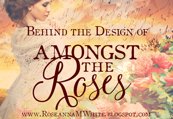
My first attempt included something else she’d mentioned, but which she decided would, in fact, be a spoiler, so I won’t even mention it or show you that first cover. ? Suffice it to say that though it was a no-go, we both fell in love with the coloring, which gave me direction for what we did eventually go with. Which began with this…
I have no idea where this picture is actually from, but living in a state that borders with Pennsylvania, I can verify that this could be a PA farm. Or WV farm. Or a MD farm. Or any other number of farms in the mid-Atlantic. ? The rolling mountain in the background, the green grass, abundant trees…yep. A perfect background. I did have to do some resizing, though, and actually stretch the grass and sky both, to end up with the needed format…
So then it was time to go in search of a heroine. There aren’t a ton of stock photos that have a genuine hoopskirt dress, but I liked the colors and positions of this girl…
The dress wasn’t wide enough, and the face and hair didn’t fit the description of the heroine, but those can, of course, be changed. Let’s start with the new head. I liked the expression on this girl’s face, and the body position was the same, so that would work.
Putting this head on the first body/dress and widening the skirt, I ended up with this…
Not a bad start! Next, of course, came the roses. I played with a few different options. First I thought maybe I’d do a trellis…
But that ended up obscuring too much of the background, and it was hard to get all the edges to look neat and tidy. So I ended up going with this shot that was in the color scheme I wanted.
Aren’t they pretty? I made them the foreground and ended up with this.
Of course, the coloring of the three different images doesn’t exactly match in this, does it? It looks like a mash-up. Looks “Photoshopped.” Isn’t natural. So I added a filter.
Much better! Isn’t it amazing how a photo filter over the different layers can draw them together? This one is Nashville, part of the Instant Hipster Photoshop Action pack.
So this is our basic image. There are, of course, still a few crucial elements missing, and some tweaking too. For starters, this girl’s hair is too dark, so I did some lightening. This can be a tricky step, actually. Darkening is easier, and making it red is the easiest of all, LOL. But with some detailed changes to the curves, brightness, levels, saturation, and coloring, I ended up with a result Meghan and I were both happy with.
Next came that text overlay, up in the sky. Had I just plopped it in there in a normal fashion, it would have looked like this:
That wouldn’t do, of course. I changed the layer blend mode to Overlay, however, and got this.
As an added bonus, this even brightened the sky, which I loved!
So now the image part is finished. It’s time to turn to the title and series name, etc. First, I added some fade layers so that the words would stand out.
This actually has two different fade layers. A cream one more in the center, where the title would go (currently where my logo is) and a teal layer on the bottom, for behind the author name. So plugging that important text in there…
The normal serif type here is Oldstyle, which has a bit of a typewriter look. I used that for both “Amongst the” and “Meghan M. Gorecki.” We tried out a few different scripts before we found the right one, and we decided on Marcella Script.
The only thing left was the series! The series Title is Keystone Legacy, and I knew she wanted a keystone incorporated into it, so I found one with stylized elements on the side, made it gold, and put the name in there.
So adding that one, we have the final front cover!
And here’s the full cover too.

The War Between the States shakes Margaret Bryant out of her comfortable
upper-class life when her father enlists in the Army of the Potomac.
Despite being safely ensconced above the Mason-Dixon Line in
Chambersburg, Pennsylvania, Margaret finds her strength tested by
opposition from familiar faces and Confederate threats. Will she let a
young man from a lesser station into her heart even as war rages ever
nearer to the homefront?
Restless Connor Doyle sees the war as a
way to escape from his family’s farm and his identity as a poor
Irishman’s son. His brother, Adam, torn between duty to country and his
family, enlists alongside Connor. Adam dares to hope in a future with
Margaret when he begins a courtship correspondence from the war front.
The two brothers make a vow to protect one another at all costs, but
when faced with death and destruction from all sides—will they be able
to uphold it?
The three bloodiest days in America’s history brings
these three together at Gettysburg and tragedy’s cruelty threatens to
tear two hearts apart—and bring two unlikely allies together.
If you follow the link I have on the title above, you’ll see that the Kindle version releases tomorrow and the paperback is already available. ?
I hope you enjoyed the peek into the cover design process on this one! What’s your favorite part of the cover?

by Roseanna White | Mar 14, 2018 | Book News, Cover Designs
Tomorrow is a special day. Tomorrow is the day when I do my very first re-release of one of my novels, with a brand new cover and title.
Tomorrow is the day when Love Finds You in Annapolis, Maryland officially goes back into the world as A Heart’s Revolution.
When Guideposts returned the rights to me, they only had two stipulations–I had to change the title, and I had to change the cover. Well, for a cover designer, that’s kinda like saying, “You have to have fun and play around with cool images.”
Shucks. ?
Of course, I wanted the title nailed down before I started playing with a design, so I came up with a handful of options and ran them by my best friend/critique partner, Stephanie, and my assistant, Rachel. The one we all loved was
A Heart’s Revolution. This title perfectly captured the theme of the book–my heroine, Lark, taking a stand for her own destiny–and also hits a sweet spot in the romance genre, what with “heart.” (I used to avoid
Love and
Heart in my titles like the plague, but I’ve given up, LOL. Here we have
A Heart’s Revolution, and the first book in my next series will be
The Number of Love.)
So, that established, I turned to the design.
In Shutterstock, I keep a collection called “Historical,” in which I’ll save every single photo I come across in all my searches that have solid historical costuming. In it are possible biblical or Roman styles, medieval, colonial, Victorian, Edwardian, 1920s, 1940s…you name it. If I think it might come in handy someday, I add it to the collection. So I already had several options saved, and I did a few new searches too.
Honestly, I had a hard time choosing between some of these! I tried out several before I decided to start from this one.
I like the movement we can see in this–the fact that she’s holding her dress up a bit and not just standing straight, and the dress itself looked accurate and not costume-y.
So I selected the model from her background and made her fill part of my canvas.
In this version, I just deleted the head, which I knew wouldn’t be the one I used. Lark wouldn’t have worn a boat in her hair like Marie Antoinette, LOL, and this lady, though lovely, doesn’t look like my heroine. But I also wasn’t sure I wanted to keep the dress exactly how it was. I wanted a little more color. So decided to make it blue.
I thought that would add some richness to the cover. So next I turned to the head. After searching for a while, I came across this model…
She fit my idea of Lark, so I searched through all the images of her and just fell in love with the sweet expression on her face in this one.
I put this head on my previous body and was relieved to find that worked well together, LOL. It’s still just roughed in here, but you get the idea.
But the hair wasn’t right. I needed more accurate to the times hair, so I decided to work from this one.
Of course, this model is blond, and I needed dark hair, but after some adjusting, I ended up with this.
Content with that much of Lark for the moment, I turned my attention to backgrounds. And oh my gracious, this was giving me a hard time! I couldn’t decide what I wanted behind her. I kinda liked the idea of keeping the
Annapolis State House there, but the photos I was finding just didn’t seem right. For starters, the story takes place during the worst winter in the history of the east coast (up to that point, anyway), and I couldn’t find anything snowy.
So first I tried some regular ol’ snowy scenes.
But none of these were “it.” What that lowest one (actually a street in Paris) showed me, though, was that I loved a street behind her. It provided a good perspective. So after fiddling with a few more street options, I eventually decided to go with an actual
Annapolis street, and worry with the snow aspect later.
I loved this perspective! I knew I was on the right track at this point, so then it was just a matter of getting the lighting right, and the snow.
I knew I could fuss with this forever, but I really didn’t want to. So instead I looked up Snow Photoshop Actions, and I found this awesome one from
Pretty Photoshop Actions for $39. I can’t tell you how often I’ve needed something like this, so I decided to make the investment, and I am SO glad I did! Playing with all the amazing options included in that action set, I could adjust lighting, make it look frosty, “kill the grass,” change the sky, and add snow!
I then ran a couple different actions, Nashville and Hefe, to alter the lighting a bit more. Nashville is over everything, Hefe just over the background to add some depth.
At this point, I was beginning to shiver in empathy for poor Lark, out in the snow without any kind of wrap! Terrible! LOL. So I went in search of cloaks she could wear and found this one that fit her body position well.
(Though I didn’t remember at the time, Lark’s cloak is even blue in the story! Perfect!) So putting that on her…
Ah, that’s better. And I was done the image! Now it was just a matter of adding the text. I chose the font Monstera, with a pretty ligature for the H, and thought it would be fun to place “A” in the curl of that H.
Of course, it would be nice to actually be able to read that title, so I added some haze behind it to make it stand out.
Much better. And of course, my name (in Requiem font).
And one final touch–a flourish in the title–and we were finished!
So what do you think of the old and new versions? Do you have a preference? (I loved the original cover, but I do love how this new version turned out too!)
If you haven’t read this early book of mine yet, here’s a bit about it, and the pre-order link. It’ll be live tomorrow!
In 1783 peace has been declared, but war still rages in the
heart of Lark Benton.
Never did Lark think she’d want to escape Emerson Fielding,
the man she’s loved all her life. But when he betrays her, she flees
Williamsburg for
Annapolis, taking refuge in the nation’s temporary capital.
There lark throws herself into a new circle of friends who force her to examine
all she believes.
Emerson follows, determined to reclaim his betrothed.
Surprised when she refuses to return with him, he realizes that in this new
nation he has come to call his own, duty is no longer enough. He must learn to
open his heart and soul to something greater—before he loses all he should have
been fighting to hold.
And be sure to stop by tomorrow, when in celebration of the official re-launch, we’ll be having a super fun contest (18th-century hair!!!) and a giveaway!
NEWSLETTER SUBSCRIBERS WILL GET AN EXCLUSIVE SNEAK PEEK!
Sign up HERE to make sure you don’t miss out!

by Roseanna White | Feb 21, 2018 | Cover Designs
A couple weeks ago, I shared a guest post from Amy Anguish about the difficulty of coming up with a title for her novel, An Unexpected Legacy (originally called For the Love of Smoothies). Today I thought I’d take you behind the scenes of the cover design process for the book, from when it was smoothie-focused to what we ended up with!
Amy is also generously offering a GIVEAWAY of her book to one lucky winner, so be sure to read all the way to the bottom for the entry form!
When we first began work on this cover, Amy and her publisher, Sandi, told me they wanted a couple sitting at a table with smoothies, looking at a photo album. Fluttering down there would be a ripped photo.
In this first version, I hadn’t yet found a photo for the fluttering bit, so there’s just a blank white piece of paper falling.
But this wasn’t it. Sandi suggested we try one with the emphasis being on the smoothies, and with the font maybe written like a spilled smoothie. So I tried this. In here, we do have a ripped photo, as well as dog tags, as the hero had been in the military.
But this wasn’t it either. None of us really liked that couple from the back. So for take 3, we decided to try out a couple holding hands on a table, smoothies at their arm, the ripped photo visible.
But this still wasn’t the vibe they wanted. After taking some time to think and reconsider, Sandi let me know that she was trying to talk Amy into changing the title (as you can read about in the previous post), and that if we wanted a more serious image, the title needed to correspond. Part of the issue we were having with these versions was that it felt too light and fun for the story. I’m sure this is partially because of my font selection, which suited the title but apparently not the tone of the book itself.
Eventually, Sandi came back to me with a new idea, a new concept, and a new title. An Unexpected Legacy, she said. And let’s try an autumnal look, with a couple viewed through a window. She also wanted something with a hint of the mystery aspect, the idea that the heroine’s aunt is trying to keep them apart. I suggested a hand holding back a curtain. As long as it didn’t look too creepy, LOL, she said that was promising.
Starting from there, I found, first, a window.
And a couple to be outside it.
Putting those together and adjusting the coloring/lighting on the window to look right, I had this.
I did lengthen his pants–they were shorts in the original photo, but a bit of smudging got those longer. And we didn’t want her pointing, so I also lowered her arm.
Next came the curtain and hand. I found this photo on Shutterstock…
…and selected the hand and curtain, plopped them on top of the working image thus far, and adjusted the colors.
In this one, I also added a burst of light there where the sun was.
This, I thought, was a pretty good base. We have our main elements–couple, window, hand pulling back curtain–so now it was just a matter of getting the full look.
For starters, for the autumnal look, I wanted some deeper reds. So I added the Sutro filter.
I loved the depth and the tones that added, so then it was a simple matter of the finishing touches. At this point, I put the (new) title and author name on.
This was at about 90% in my opinion. But that last 10% is key. So to take it up another few degrees, I added two things. First, a fun little flourish behind the title, for a hint of the original whimsy.
And then light rays coming from that sun, because we all know how those gorgeous beams look, coming through a window in the fall. This is a very subtle change, but it adds something to the overall.
I still wasn’t quite satisfied though. That upper left corner felt too empty. So I decided to add some autumn leaves.
Much better! These are using the Color Burn blending mode, which gives it that particular shading. Happy enough to show Sandi and Amy, I sent this version to them. Sandi asked if there could be a single falling leaf somewhere, which I thought was perfect. So I added that.
And here it is! This ended up being the final front cover, but Amy did still want to see it with her original title, so I made one with the same fonts but the old words.
Seeing the two side by side helped her decide on the new title, I think. =) But I promised that we could incorporate the smoothies and dogtags on the back. Using this image of the smoothies…
…and these dog tags…
…with this bokeh to add the same light and coloring as the front…
…gave me this.
Toss the words on the back, and voila!
So here’s the full cover.
What do you think? Do you like the direction we ended up going in? The new title?
Interested in owning a paperback of this book? If so, you can enter the giveaway below!
Giveaway
Please enter via the Rafflecopter form below. Giveaway ends 2/27/18 11:59PST. US mailing addresses only. Void where prohibited.


 Roseanna M. White is a bestselling, Christy Award winning author who has long claimed that words are the air she breathes. Having successfully launched two homeschool grads, she now spends her time writing fiction, designing book covers, and pretending her house will clean itself. Roseanna is the author of a slew of historical novels that span several continents and thousands of years, as well as a fantasy series and contemporary mysteries and romances. Spies and war and mayhem always seem to find their way into her books…to offset her real life, which is blessedly ordinary.