
by Roseanna White | Nov 16, 2016 | Cover Designs
It’s been a while since I’ve gone behind the design, and this week one of my designs just released, so it seems like a great time to feature it. =)
Forgiven is author Carol Ashby’s debut novel–an impeccably researched tale of love in first century Judea. Obviously I was excited to work with Carol, this being one of my favorite genres and settings. And as I worked with her, I quickly discovered that Carol knows her history very well. If you check out her website, you’ll find a TON of extras on the history.
For the cover of this first book in her Light in the Empire Series, she wanted something that showed her Messianic Jewish heroine, her Roman centurion hero, and the distance/tension between the two.
Now, there aren’t a ton of stock photos out there with women in biblical era dress. Trust me. I’ve searched and searched for it. And I wanted to give Carol something very unique for her cover. So rather than go with one of the photos of a woman in a head scarf that I’m seeing on covers everywhere, I actually started here.
Now, there are a lot of things wrong with this photo. Her jewelry. Her makeup. The fact that the sash crosses over her chest. The shoes. The dress has no sleeves. And she’s not wearing a head covering at all.
But thanks to the wonders of Photoshop, I could turn her into this:
How? Honestly, it took a lot of work. I started by cleaning the makeup off her face and duplicating some of the folds of the dress to create a v-neck. In this version, I’d also used the fabulous clone-stamp and smudge tools to eliminate the jewelry.
Changing the sash to red, per the author’s instructions, was actually quite easy–red is one of those colors that you can add with a few clicks in Photoshop, but which it’s a pain to try to get rid of.
Of course, our Rachel here needed sleeves too. So I added those by copying and reshaping parts of the dress, and then changing their transparency.
And then the veil. For this, I actually borrowed a veil from a lovely Indian model…
Did a bit of adjusting, of course, and got this:
The only thing left to change was her shoe. It was a pretty simple matter of switching out the original toe —
with one in a sandal.
At this point I was happy with Rachel, and it was time to turn to the hero, Lucius.
Oh. My. Gracious. He was complicated. Why? Because no stock photos have centurion garb right, and the author is a stickler for authenticity (understandably!), so I had to do a LOT of manipulation and combining of photos.
So I started with this guy…
Used the leather bottom part of this guy…
The face of this guy…
And then had to give him a scar from this lovely fellow.
The author actually has a collection of swords and daggers (or her son does, anyway), so she provided the photo of the appropriate weaponry to have at his side.
Putting him all together (and off-setting for correct positioning on the cover), we get this.
Now we had our characters, so it was time to turn to the background. I wanted to keep part of the stone archway Rachel is leaning on–I loved how it framed the cover, and it gave a nice old-world vibe. But to have stone completely behind her as in the original photo was too dark and boring. So I took out that back wall and replaced it with a view of the Galilean countryside.
So here’s our complete picture, minus the words.
For the title, I combined two fonts (Cinzel Decorative and Maphylla) and used a cool design to set it off.
I echoed the design behind the series title up top, added the author name in one of my go-to, favorite fonts (Linux Libertine) and voila!
When it came time to do the full cover, I went RED. It echoed both his cape and her sash, which I loved. I did a fairly simple combination of red with that archway, and framed the text within it.
So here’s the official blurb!
Are some wounds
too deep to forgive?
With a ruthless father who murdered for the family inheritance, Marcus Drusus plans to do the same. In AD 122, Marcus follows his brother Lucius to Judaea and plots to frame a zealot for his older brother’s death. But the plan goes awry, and Lucius is rescued by a Messianic Jewish woman. Her oldest brother is a zealot and a Roman soldier killed her twin, but Rachel still persuades her father Joseph to put his love for Jesus above his anger with Rome and hide Lucius until he heals.
Rachel cares for the enemy, and more than broken bones heal as duty turns to love. Lucius embraces Joseph’s faith in Jesus, but sharing a faith doesn’t heal all wounds. Even before revealed secrets slice open old scars, Joseph wants no Roman son-in-law. With Rachel’s zealot brother suspecting he’s a Roman officer and his own brother planning to kill him when he returns, can Lucius survive long enough to change Joseph’s mind?
Sounds great, doesn’t it? I read little bits and pieces while I was laying out the interior, and let’s just say it’s a book I’m looking forward to purchasing and reading when I have some time!
You can find the digital on Amazon now, and the paperback will be available November 20.

by Roseanna White | Oct 12, 2016 | Book News, Cover Designs
There’s something about seeing the cover for the first book in a new series.
Maybe it’s because it’s a whole new style, a whole new look that you know will carry out through the subsequent books.
Maybe it’s because there are new themes, new characters.
Or maybe it’s just because it’s always exciting to get a new cover, no matter the number in the series. 😉
Regardless, I was sooooooo excited to see this when I got my first glimpse a month ago, and I am equally excited to get to share it with you now! This cover totally and completely (in my opinion, LOL) captures the essence of the story. Rosemary–perfect. The books!–perfect. The pose–perfect. *Blissful sigh*
A Name Unknown will release next July. Description below. But for now . . . THE COVER!!!!!
About
Edwardian Romance and History Gains a Twist of Suspense
Rosemary Gresham has no family beyond the band of former urchins that helped
her survive as a girl in the mean streets of London. Grown now, they concentrate
on stealing high-value items and have learned how to blend into upper-class
society. But when Rosemary must determine whether a certain wealthy gentleman
is loyal to Britain or to Germany, she is in for the challenge of a lifetime.
How does one steal a family’s history, their very name?
Peter Holstein, given his family’s German blood, writes his popular series of
adventure novels under a pen name. With European politics boiling and his own
neighbors suspicious of him, Peter debates whether it might be best to change
his name for good. When Rosemary shows up at his door pretending to be a
historian and offering to help him trace his family history, his question might
be answered.
But as the two work together and Rosemary sees his gracious reaction to his
neighbors’ scornful attacks, she wonders if her assignment is going down the
wrong path. Is it too late to help him prove that he’s more than his name?
~*~
I know, I know–you are now so eager to get your hands on this book that you want to rush out and pre-order a copy. Ahem. 😉 The Amazon link is live–I’ll post others as they appear.

by Roseanna White | May 11, 2016 | Cover Designs
A few months ago, I had one of those heart-racing moments. On an email list I belong to, a well-established author mentioned that she was re-releasing some of her backlist and asked for cover designer recommendations. Obviously, I offered my services. And was beyond thrilled when she hired me.
Because this is Stephanie Grace Whitson, whose books I passed many a teenaged weekend with. I have quite a few of them on my shelf to this day. So to get to help breathe new life into some of those older titles . . . well, that’s just pretty darn cool. =)
The first series up for new covers was The Keepsake Legacies Series: Sarah’s Patchwork, Karyn’s Memory Box, and Nora’s Ribbon of Memories.
First, of course, came the first one. Steph had sent along some photographs she had of the house she based the one in the book on, so I started there.
Of course, that’s just a little tiny photo, and it’s a scan of a paper photo, so I couldn’t enlarge it too much without losing quality. So I kept it small, and added in a big blue sky with some white clouds. Since this picture also ended rather abruptly, I also found another picture of a house with more of the surrounding area and stole some trees and yard and sidewalk. 😉
That seemed like a pretty good background to get me started; which meant it was time to tackle the model. This can be tricky for a historical. And especially tricky if you don’t just want to use the same stock images that everyone else is using. I do that sometimes, but I wanted something really special because this is Stephanie Grace Whitson. 😉 So I decided to build the models. Ahem. Just like Legos. 😉
I started with a model who I thought matched her character rather well.
I liked her hair, the way she was looking down . . . of course, the dress wasn’t right. And I wanted to get rid of that flower in her hair. So I copied some other hair from another pose of the same model in to get rid of the flower, and off I went to hunt for costuming.
I ended up choosing, in part, a public domain image of a dress from the appropriate era.
The styling was right, and I liked the white for this innocent young heroine . . . but it was way too frilly and over-the-top for her to be wearing on an everyday basis, and Steph had stressed “nothing fancy.” So I decided to turn it into a shirtwaist and use another image of a plain skirt.
Of course, I had to do some copying and pasting to get the sleeve to fit around the model’s arm, and paste the hand on top so it was interacting with this garment. Also fit the high collar around her face better with some copying and deleting. Love how it turned out.
I liked the composition of this, but I wanted a softer look. First I ran a Photoshop Action, which is a pre-set list of steps taken to change shading that you can overlay over a work with a single click. I also added a texture, to get this.
Then it was time for words. I started with Stephanie’s name, at the top and attention-grabbing. It’s in a standard font (one of my favorites, Linux Libertine), arranged so that the last name is as wide as first and middle together. To get it stand out, I faded a layer of cream out behind it, just a bit.
Now the series name. I knew this would have to be consistent across all the books, and I wanted to make it simple and elegant, but also easy to read in a thumbnail. I decided to put it at the bottom, with some elegant scrollwork behind it (and another faded layer to make it stand out). The font is the same as the author name.
Now, of course, the title. I wanted to combine the elegant Linux Libertine font with a beautiful script. so I went with Maphylla for the name and made it large. In typical me-fashion, I wove the two words together a bit, and also added a texture to “Sarah’s.”
I sent it to Steph, expecting the usual requests for tweaks and changes. To my surprise and delight, she absolutely loved it just as it was. =) Here’s how it turned out when I did the full cover.
Of course, the rest of the series wasn’t quite so easy. 😉 But I love how they eventually turned out too.
In these cases, the titles were simple, since I already had the fonts and positioning chosen. I just had to worry with main images. For #2, we were dealing with a sod house. Steph had sent a photo she had of one of those too, but I ended up using a stock image of the same one, from a slightly better perspective. 😉
She’s also sent me this image, as who her heroine was based on.
So off I went in search of a match. As I browsed model images, this one grabbed me right away.
There were similarities in the face shape, eye shape, etc. Of course, her hair was the wrong color, and she was a bit more glamorous than that black and white, LOL. But hair color can be changed, makeup can be digitally toned down, and I just loved the expression on her face. So I plugged her in, in front of the sod house.
But obviously the wedding dress wasn’t “it.” I put the same skirt on her as was on Sarah, changing the color, and debated what to do for the top. I decided a shawl might be cool, so I searched for images of a woman with a shawl. This one seemed promising, so I gave it a try.
Darkening the redhead’s hair to match the color in the shawl picture (which was the correct color for Karyn), I ended up with this.
Of course, I needed a background, and I decided to try a stormy sky. I put that in and then I put on the words and sent to Stephanie.
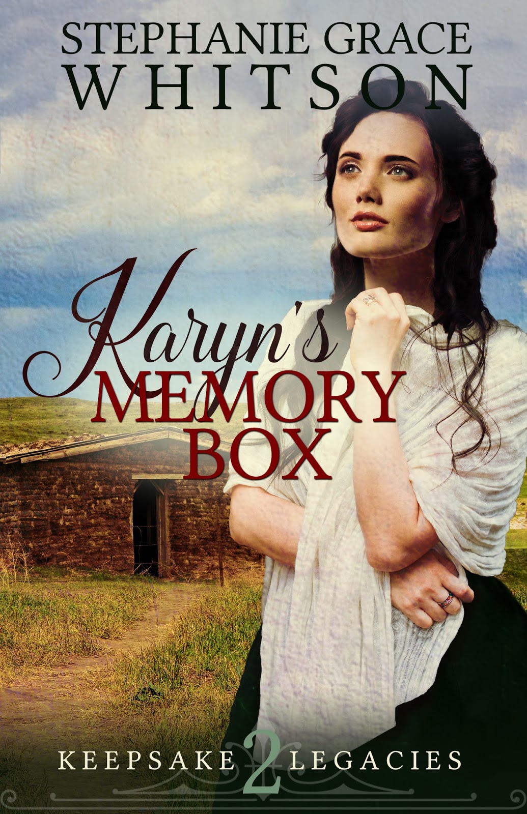
She wasn’t sure about this one. She definitely didn’t like the stormy sky (too brown–which I can certainly see), and was concerned that the model was too beauty-model and not “ethnic” enough. Changing out the sky was easy.
And I tried some other models.
Looking at them all side-by-side, Steph decided there was something about the expression on the first model’s face that called to her, too, so she asked to see that model on the brighter background. And we ended up with our final.
And the full cover…
And finally, book 3.
This one promised to be a bit trickier. Steph wanted the store in the background, which meant I’d be hard-pressed to have any sky in there, as there aren’t many pictures of buildings like that with sky behind them. But Steph found this storefront image that she really liked, aside from the incorrect words on it.
And she suggested this model for the clothing.
Now, I love this series of this model–so much in fact that I’d already used it for WhiteFire’s Austen in Austin. I really don’t like to use the same images for multiple covers, so I decided I’d just make it so different you wouldn’t readily be able to tell it was the same. 😉
To start with, I tweaked the building as needed, and even took photos of some hats and hatboxes lying around my house (ahem) to fill the window and put the actual name of the shop in the story on it. Then I put in this model picture and changed the dress to a deep red. (And deleted the poor woman’s head, since she didn’t match the description.
I considered a version of this model with a parasol, but the parasol would have completely obscured the building. That idea had to go bye-bye, even though I knew this one’s spyglass wouldn’t be able to stay either. Then I went searching for a face that would match her description of Nora. I fell pretty quickly in love with this lovely lady for my purposes.
She fit the image perfectly in terms of body positioning, etc.
Interesting tidbit–Stephanie wasn’t sure at first that she matched the description of Nora, so went back to find a paragraph in the book describing her. As it turned out, my wild guesses matched the description perfectly! Full lips, perfectly arched brows, honey-blond hair. Yay! Always cool when that happens, LOL.
But of course, this woman’s makeup was Too. Much. Especially that red lipstick. I found someone with a a natural looking mouth…
…copied just that mouth, and then actually manipulated its shape to exactly match the model. Voila.
The final step was to get rid of the spyglass in her hands and replace it with something more appropriate. I found an image of a closed parasol and worked that in there.
Which gave us our final front.
And of course, the full. =)
So there we have it! The complete Keepsake Legacies Series. I love how these turned out, and I was so glad to know that Stephanie was pleased as well. Soon we’ll be getting started on the second series she’s re-releasing, and I’m excited to see where that one takes us. =)

by Roseanna White | Feb 9, 2016 | Announcements, Books, Cover Designs
I have been so excited over the covers for my Ladies of the Manor series with Bethany House. The elegance. The simplicity. The colors.
We have oohed and ahhed over Brook in The Lost Heiress.
We have gone ga-ga over Rowena in The Reluctant Duchess. (Because seriously. That. Dress.)
And now, we get our first glimpse of Ella. She’s fun. She’s optimistic. She always, always finds something to smile about…even when no one else can figure out why. And when the world tells her she shouldn’t, well…Ella is still going to love. She is indeed A Lady Unrivaled.
And here she is!
Lady Ella Myerston can always find a reason to smile–even if it’s just
in hope that tomorrow will be better than today. All her life everyone
has tried to protect her from the realities of the world, but Ella knows
very well the danger that has haunted her brother and their friend, and
she won’t wait for it to strike again. She intends to take action . . .
and if that happens to involve an adventurous trip to the Cotswolds,
then so much the better.
Lord Cayton has already broken two
hearts, including that of his first wife, who died before he could
convince himself to love her. Now he’s determined to live a better life.
But that proves complicated when old friends arrive on the scene and
try to threaten him into a life of crime. He does his best to remove the
intriguing Lady Ella from danger, but the stubborn girl won’t budge.
How else can he redeem himself, though, but by saving her–and his
daughter–from those dangerous people who seem ready to destroy them
all?

by Roseanna White | Jan 13, 2016 | Cover Designs, Remember When Wednesdays
What a busy week! Last Tuesday I finished Giver of Wonders, which was a fabulous feeling. I’m waiting on a certain something to happen before sharing with you all some certain exciting news…so in the meantime, I’ve been catching up on some of my design work.
Over the summer I discovered a site where authors post about their projects and the price they’ll pay for a cover, then designers compete to make the winning design. It’s fun (if unpredictable), and I found some new clients that way…and I also designed a lot of covers that never got used. I really love some of these covers, so that seemed like a waste to me, LOL. So I just launched a new feature on my design website!
Most indie authors have heard of pre-made covers. It’s pretty simple. The main design work is done, so they’re cheaper than having a cover designed from scratch. But for that cheaper price, you only get very limited customization. Your title, your name, your spine size and back cover copy if it’s for paperback. That’s it. Further customization can certainly be done, but it’ll bump the price back up into the realm of where it would normally be.
My pre-made cover section just went live last night! I don’t have all the categories filled out yet, but there are at least a couple in each one. So if you’ve been considering a cover or just want to browse, feel free to head over to Roseanna White Designs and see what’s there! (And yes, I designed a zombie cover. Because, come on, how fun is that??)
If ever you purchase a pre-made cover from me, rest assured it is still unique. I will take them down after purchase, so there’s nod anger of someone else running around with YOUR cover, just a different title. 😉
And I also designed two covers for WhiteFire this week. Watcha think?
Love, Lace, and Minor Alterations is a romantic comedy coming in June from debut author V. Joy Palmer. Think Say Yes to the Dress meets Christian comedy. This girl has some amazing voice going on!
This non-fiction book by Christine Lindsay is the book of her heart–the one in which she shares the struggle of giving up her daughter for adoption, and the long road to healing…and finding each other again. Finding Sarah, Finding Me has sections written by Sarah, her birthdaughter, and other contributors who have been on both side of the adoption story.

by Roseanna White | Feb 4, 2015 | Cover Designs
WhiteFire has contracted a series that’s going to be so much fun. This is a stand-alone series, where each book will be able to stand totally on its own and be read out of order, set around the Worlds Fairs of the early 20th century. History, romance, and a bit of suspense in each one…yes, please!
The author is Suzie Johnson, author of Sweet Mountain Music and some contemporaries too. Suzie is a complete sweetheart, and it’s a true pleasure to work with her. So naturally, I want to give her the best possible covers for this series. (Okay, I always want to give an author the best possible cover, LOL. But you know.) I started playing around months ago.
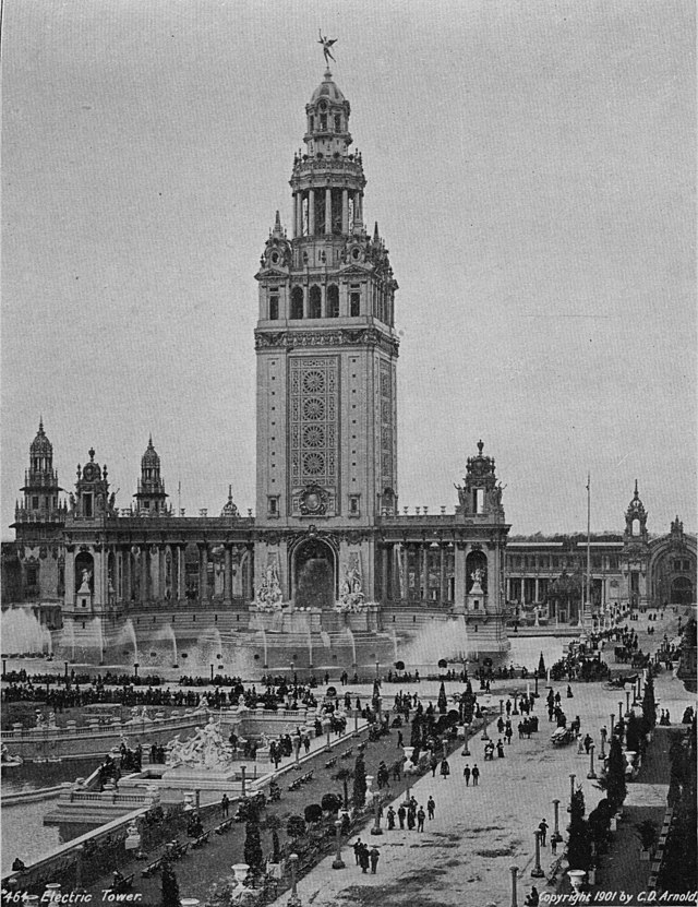
The time period is Edwardian. Always fun…but stock photos are limited. My first idea combined this photo:
with this photo of the PanAmerican Expo in Buffalo:
Which resulted in this:
Not a bad starting place. We both really liked it. And we came this close to going with it…but here’s the problem. I couldn’t replicate the layout for the other books in the series–agghhhh!
So I kept going back to the drawing board. First trying, trying, trying to find images that would work for books 2 and 3 along a similar line. And failing, failing, failing. My search for Edwardian images led me all over the web.
I even came across some public domain photography of the actress Lily Elsie, on which Suzie’s heroine, Clara, is based.
And then, on Deviant Art, I came across a stunning colorization of her.
Oh. My. Gracious. I was in love. I promptly downloaded it, slapped the existing title on it, and sent it to Suzie to see if I was just insane or if this was It. She assured me I wasn’t crazy, LOL, that this would be a GORGEOUS cover.
So I emailed the artist from Deviant Art and prayed, prayed, prayed she would answer and let us use her gorgeous work. And in the meantime, did a bit of research, learning that any photograph taken before 1924 is considered public domain, so yes, we’re okay with using one of Lily.
Well much to our delight, the artist, Alena Dufkova, was happy to let us use her colorization, and agreed to do more for us for the later books in the series! Yay!
My work on this one was really easy. I zoomed the photo so that the book cover will cut off the upper part of her hair, a bit of her side, and leave me some space for the title. Then I selected the background and flipping it around so that the space behind Lily/Clara on our cover wouldn’t be so empty.
In this photo, you’re also seeing the 2 small tweaks we needed to make to make Lily into Clara–hair needed to be auburn, and eyes green. This is an easy fix. For the hair, I select it with my Quick Select tool
Then I adjust the color balance of the selection, edging it more toward red.
A subtle change, but all that we needed. =) I just went in with the paintbrush to get her eyes green, and then it was time for the font treatment.
I liked the fonts we used on the first comp of the cover, so I did that again, using The Alistaren Beta font from www.dafont.com. This time I added a gradient overlay to “Fair” and “Remember.” I chose a frame, made the frame white, and filled it with a complementary color, faded to 70% opacity.
Instead of the series name saying “Book 1,” I decided we’d put the year–that way anyone who wanted to read them in chronological order could, but no one would look at it and say “Gee, I can’t read this one, it’s book 2…”
Adding Suzie’s name to the bottom, we get a “Voila!”


.jpg/1024px-Woman's_Dress_LACMA_M.2007.211.850a-b_(1_of_4).jpg)


 Roseanna M. White is a bestselling, Christy Award winning author who has long claimed that words are the air she breathes. Having successfully launched two homeschool grads, she now spends her time writing fiction, designing book covers, and pretending her house will clean itself. Roseanna is the author of a slew of historical novels that span several continents and thousands of years, as well as a fantasy series and contemporary mysteries and romances. Spies and war and mayhem always seem to find their way into her books…to offset her real life, which is blessedly ordinary.
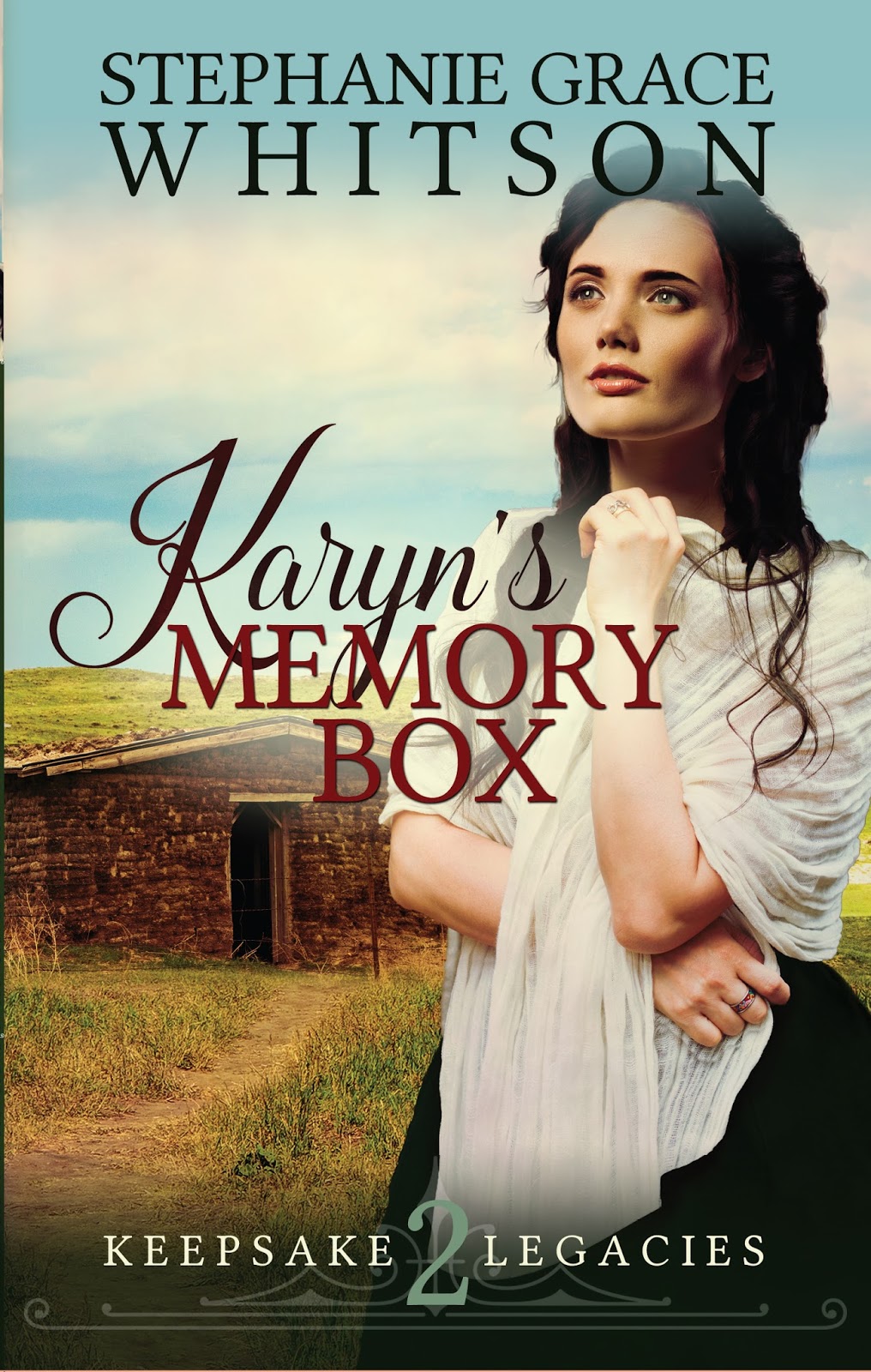