Not exactly a book cover design, but the same general idea. 😉 I had the pleasure a week or so ago of designing a header for a new blog by the awesome Sandi Rog, and I thought it would be fun to break it down for you like I do the book covers.
The blog is called The Lord’s Lady: Women Growing in the Word, and it’s dedicated to study and meditating on Scripture. I’ve subscribed and am looking forward to digging deeper into faith with other women who share my heart.

For anyone who doesn’t know already, Sandi is a cancer survivor–a miraculous one. A few years ago she was diagnosed with an extremely aggressive form of T-cell lymphoma. She underwent treatment after treatment, course after course of chemotherapy and radiation that left her body weak and broken. I can’t tell you how many times I got an email saying she’d ended up in the hospital again. Then we thought she was on the mend…that the treatments had worked…that healing had come–only to learn from a Good Friday MRI that she had 5 new tumors.
Sandi knew she wouldn’t survive another round of chemo or radiation. She knew that she couldn’t turn into that shell again, the one that couldn’t get off the couch to take care of her young children. So when the Lord whispered that she should try the natural route, she obeyed, and asked others to step out in faith with her. I joyfully joined the prayers for my dear friend, believing with her that this would work.
Her cancer has been in remission for 2 years now, thanks to faith and vitamin B17. And though Sandi has had a hard time getting back to writing novels, she wants to pour her heart into this blog, and I’m so excited to join in.
So. The header. =) Sandi emailed with details on exactly what she was looking for. A medieval looking woman in the foreground, most of her face not visible. She wanted her to be cradling a sword in her lap. Reverently, almost tenderly. And in the background, a castle.
Armed with those instructions, I went on the hunt for images. I came back with a few possibilities.

The one on the bottom wasn’t holding a sword, of course, but we both liked the lighting and the soft look of her, so she won.
Which meant I had my work cut out for me, LOL. I started, as always, by deleting her background.

I played around a bit to figure out how to input a sword–first trying to have her holding it out before her, in her lap, like Sandi originally envisioned, but the sword got lost against the pale background of the model’s dress. So Sandi said, “Can she be holding it up like the woman in the other picture?”
Could she? Hmm. I thought I could get it close. So I chose a medieval sword that I could use for free from Wikimedia Commons:

And then I posed the model by copying her arm, rotating it, and filling in the empty space it created with her veil.

The hand here isn’t perfect, but I knew it would be covered up once I put the sword into place.

As you can see, the sword stands out far too much…and looks she’s just balancing it on one hand. The image would be cropped to fit on the header, but I still needed to do some playing. I ended up up cutting and pasting the part of the sword that goes off to the left and then changing its opacity so that it looked like the veil was overtop it, and thereby meeting up with her invisible right right.
I also adjusted the color balance on the sword layer, yellowing it to give me the same lighting effect as the model.

And for fun…a little gleam on the blade.

Well, that was the hard part! Next was filling in her background. I found a free image of a castle. There were a ton, but I picked one that looked fairy tale pretty.
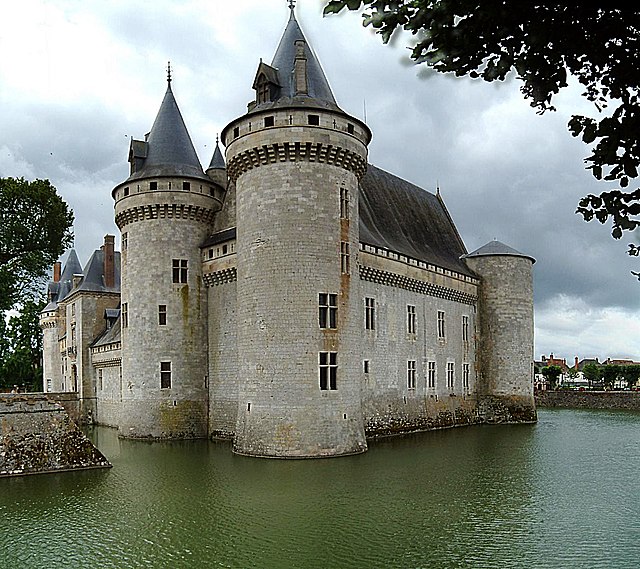 |
| Chateau Sully sur Loire |
Then, of course, I deleted the background and changed the color balance to match the buttery tones of the rest of the picture.

Isn’t that pretty as a picture? 😉
Now to put the two together. I did a simple blue-gray for sky (adding some low-opacity white for clouds) and green for the ground and plopped them together.

Believe it or not, we’re almost there. 😉 I chose a texture layer to put overtop the whole thing. I wanted something that conveyed light and flame, so I went with this one.

Taking it down to 75% opacity and choosing Lighten as my blending mode, we end up with this.

I want a bit more detail though…a pattern to add into the corner. I waste some time looking for medieval symbols or engravings, and eventually find, of all things, a free vector with tattoo designs, LOL. In that package I found a fun cross-in-a-circle that hit the right note. So I add that in.

Now all that’s left are the words! I tried a few arrangements and colors, before Sandi said “This arrangement, but how about burgundy? Which was perfect. She also requested that I link the letters together, so voila.

We added the subtitle, and there we have it! I put all those elements together, and we have our lovely final product, ready to be the header on a blog I know will touch hearts.

Check out Sandi’s blog at: http://thelordslady2.blogspot.com/ !!!!

 Roseanna M. White is a bestselling, Christy Award winning author who has long claimed that words are the air she breathes. Having successfully launched two homeschool grads, she now spends her time writing fiction, designing book covers, and pretending her house will clean itself. Roseanna is the author of a slew of historical novels that span several continents and thousands of years, as well as a fantasy series and contemporary mysteries and romances. Spies and war and mayhem always seem to find their way into her books…to offset her real life, which is blessedly ordinary.
Roseanna, I just love seeing the details of what you went through to make this happen! Thank you again! You are THEE BEST! 🙂
Wow what a powerful story that Sandi has! God is good!
I love what you did to make her blog header! Sp pretty!