by Roseanna White | Feb 6, 2014 | Thoughtful Thursdays, Uncategorized
|
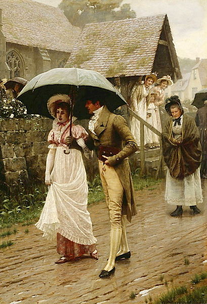
| A Wet Sunday Morning by Edmund Blair Leighton |
I am a Sabbath keeper.
I don’t talk about it much online because, well, it doesn’t come up a whole lot. But it’s something I make sure those I work with know, since they’re unlikely to have their questions answered by me on Saturday, but will find me hard at work on Sundays. Today, though, I want to talk about it.
Last Saturday, my dad (pastor at my Seventh Day Baptist church), preached on the Sabbath. He doesn’t do this often, but it’s a topic we’ve discussed quite a bit in church for obvious reasons, and I was curious what else he could find to say about it. His message really intrigued me. And made me want to proclaim that yes, I keep the Sabbath.
He read from Exodus, but not the part I expected. Before, we’ve focused our attention on the verse in the Ten Commandments. This time, he read from a later section of Moses’s tenure on Mt. Sinai, in chapter 31.
Surely
My Sabbaths you shall keep, for it is a sign between Me and you
throughout your generations, that you may know that I am the Lord who sanctifies you. 14 You
shall keep the Sabbath, therefore, for it is holy to you.
I’ve read Exodus quite a few times, but I’d never noticed that before. And I loved the context Dad gave it. Back in that day, the sun was the center of worship in nearly all major religions. The chief god of most pantheons is represented by the sun. So from the dawn of time, more or less, there was a day named after it, the first day of the week. That was the day when most people in the ancient world worshiped.
God wanted something different for His people. He wanted them to be set apart. So worshiping instead on the last day of the week was an outward sign. It was a clear statement that they belonged to the living God. The God who is not represented by the sun, but who created it. That’s pretty cool, right? The Jewish day of worship is a testament, and a covenant. It’s a sign not just for man, but between man and God. It’s His people saying, “Yes, Lord, here I am to worship!”
I’ve heard a lot of reasoning for why Christians worship on Sunday, and most of it comes down to tradition. In the first church, most of the believers were still Jewish, and they would still go to the temple on the Sabbath. They would therefore gather with the Christians the following day. Okay. I’m totally cool with that. But as with many of our holidays, it became the “official” day of worship when Constantine made it the official Roman religion. He wanted it to palatable to his people, so he said they shouldn’t change their day of worship.
Now, I’m the first to say that our day or worship is by no means a matter of salvation. That starts and ends with belief in Christ. I totally understand that we live in a society that really doesn’t care anymore about religious days, and we could lose our jobs sometimes if we insisted on a particular day off. I understand that for most people, the thought of changing from Sunday to Saturday just doesn’t make sense in their heads. Isn’t Sunday the Lord’s day? The day Jesus rose from the dead?
Yes, it’s the day He rose from the dead. But the disciples still called Saturday “the Lord’s day.” But didn’t He free us from those laws and rules?
He freed us from the judgment of them, yes. And redefined the ceremonial laws. But the order to keep the Sabbath is one of the Ten Commandments. I’m not sure why Christianity has decided to toss number 4 out the window but insist that the other 9 must be followed out of loving obedience. We don’t think murdering or adultery is right…so why do we forget the one the we were told to remember? It’s not a ceremonial law, it’s a moral one.
And as I sat in church last Saturday, I realized why it’s a moral one. Because it marks us as God’s. That’s something I wouldn’t trade for the world.
Now, I know this post is unlikely to change anything for anyone, LOL. Most Christians will still go to church on Sunday, and that’s totally fine. Again, it’s not a matter of salvation. I certainly don’t judge anyone for following centuries-long tradition. But I just wanted to publicly claim my covenant with God. I am choosing, now as I first did ten years ago, to remember the Sabbath. I am choosing to keep it holy. Because He is the God who sanctifies me, and this is the day He set aside.
I am a Sabbath keeper.

by Roseanna White | Feb 5, 2014 | Ancient World, Remember When Wednesdays
I’ve been enjoying my tenure back in Ancient Rome. Much as I miss my Culper Ring characters, it feels a bit like going home to return to the world of A Stray Drop of Blood and dig into life at the Visibullis villa outside Rome.
I haven’t chatted a whole lot about it here though. Some, but not a lot. In part because I haven’t been doing a ton of research. While, say,
Jewel of Persia revolved around the historical events of the day,
A Soft Breath of Wind is more about the people that made up the early Church. I haven’t had to look up things like fashion and housing much, because I already have that research on hand from
Stray Drop. I haven’t had to do a ton of research on what was happening in the world that year, because, well, there wasn’t much worth noting, and my story revolves around those fictional lives.
But I’ve still had to look up a few things here or there, so I figured I’d share some of the fun things I learned recently. =)
First, scissors. One of my primary characters is Samuel.
Stray Drop readers will remember him as the little boy that Jason rescues, whom Abigail ends up adopting as her son. In
A Soft Breath of Wind he’s all grown up and still the nurturer he was as a boy. He has, in fact, gotten some training from a physician and now serves as villa doctor whenever anyone needs him.
My accident-prone heroine often needs him. =) I had a scene in which she falls off a stone wall and knocks her head pretty good, so he has to stitch her up. It was one of those where I’m describing the action as he’s talking to her mother, things like pulling the silk thread taut and then snipping it–somehow. What would he have used? A knife? Did they have scissors? (Yes, the things I have to question!)
Insert Roseanna jumping over to Google and asking. And finding these.
 |
| Picture from at the Metropolitan Museum in New York City in 2006 by Yannick Trottier |
Apparently scissors have been around for a goodly while, LOL. These are labeled as being from the 2nd century, Turkish in design. But they follow the basic design used as far back as 1500 B.C., when they were invented in Egypt.
Sweet. So he can have scissors. =)
Around the same time, I was looking for details about Roman vineyards. I did a fair bit of reading, but one thing that really stuck out to me was that they used elm trees among the rows of grapes! I had no idea, but it’s pretty clever. The trees provide some shade, and the straight, slender trunks can be used like stakes to train the vines along. So when my characters wander the rows, they would have not just clusters of grapes at hand, but also elm trees.
Good to know. =)
So there’s just a taste of everyday life for Zipporah, Benjamin, Samuel, and Dara. Now back I go into their world. 😉

by Roseanna White | Feb 3, 2014 | Word of the Week
First of all, my apologies to anyone who missed my Thoughtful Thursday last week–I was taking a sick day. Just a cold, which I’m happy to say didn’t get as bad for me as it did for my hubby. Not that I’m happy it involved a fever for the hubby–you know what I mean. 😉
Anyway! A new week, and on we go to our feature word. So go ahead. Ask “Why in the world are we talking about doorknobs??”
Well, I’ll tell you. Because until 1847, we wouldn’t have been. That’s right–doorknob is only 167 years old! Which is darn new, considering how old doors are. 😉 But up until the 19th century, most doors used latches or handles rather than knobs. In fact, the knob we know and love wasn’t patented until 1878.
Who knew, right? 😉 So we historical writers better be sure to never have our medieval heroine carefully turning the knob and sneaking into a room. Just sayin’.
Happy February, all!

by Roseanna White | Jan 29, 2014 | Remember When Wednesdays
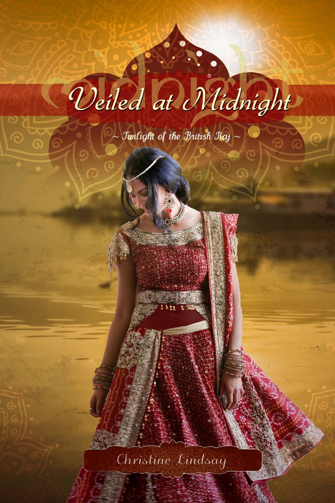
WhiteFire’s first series to be contracted and completed just got its final cover. The Twilight of the British Raj has won some awards and garnered a lot of very well-deserved praise. And when Christine Lindsay (the author) and I started chatting covers for the final installment, Veiled at Midnight, I think we were both rubbing our hands together in delight.
The first book of the series took place in British India of 1919. It was one of WhiteFire’s first two titles other than mine, and at that point, I was not designing covers. We hired the amazing George of Tekeme Studios, and he blew us away with this fabulous cover for Shadowed in Silk.
By the time book 2, Captured by Moonlight, rolled around, I had wet my feet in the design world, and Christine and I discussed it and agreed I’d try my hand at mimicking the style of the first with the images we had in mind for the second.
This third book jumps a generation. Set during the tumultuous partitioning of India and Pakistan in the 1940s, our hero and heroine are Cam, the little boy from the first book, and Dassah, who was a baby in the first book. I haven’t yet gotten my hands on the MS, but I know what an amazing writer Christine is, and I know we’re in for another sweeping saga of romance and suspense!
Christine started a Pinterest page for the book, which is where our idea-gathering began. She wanted gold on the cover, to represent the Joy of a new dawn. Though “midnight” is in the title (the Partition took effect at midnight), she wanted the images to represent a new day. (Not to mention we already had a night scene on cover 2…)
Our first thought was to use green and gold, to represent the Pakistan flag. The most compelling images we found were of a night sky, and my (very very very very very sloppy) playing around led to this.
Not bad. The lighting in that sky is amazing. But the original image of the model had her in a red sari, and changing red to gold is T-O-U-G-H. I managed a fair imitation with the low-resolution comp I downloaded from Shutterstock, but I knew it would be much harder with the real photo. So I was pretty happy when Christine emailed and said that her critique partner convinced her that red might be okay. It was a color Dassah had shied away from in the earlier part of the book, because it reminded her too much of all the blood that had been spilt. But they decided that later in the book, she could instead realize it also represented the blood of salvation.
So we began with this model picture from Shutterstock. We both loved the pose, and I especially loved the motion in the sari.
Obviously, next we take out the background.
Now, you’ll notice that in this traditional sari, the belly is showing. This is accurate, both today and historically, but we decided that for a CBA book, we probably shouldn’t have the bare flesh. So I inserted a semi-transparent layer to mimic sheer fabric there.
Now it was time for the background. There are some absolutely GORGEOUS images of India that we considered. I knew the characters spend some time at a mountain lake, and I knew we wanted gold tones, so I decided to try out this one.
Plopping Dassah in front of it, I got this.
A good start. I liked the colors together, and the water. But I wasn’t wild about how distinct that building is in the back. And Christine pointed out (later, but let’s show the change now, LOL), that the light is hitting her on the wrong side. So I flipped her.
To blur the background in the distance, but not the water up close–because I LOVE that reflection–I duplicated the layer, blurred the top one, and then applied a layer mask and faded the top image from the bottom of the screen upward–that way, the bottom layer comes through in its non-blurred glory toward the lower portion and fades into the blurred image at the top.
Pretty, yes? But not there yet. The covers for this series are rich with texture layers. So to get the full effect and really see if it was going to give me the look I was going for, I first added in the elements that would stay the same as the first books (but with color changes)–the one I call “the lotus thingy” and the “banner thingy” that goes behind the title.
Oo, I was starting to like how this was coming together! I went ahead and added the title. Which, for these books, includes the title itself, then the last word faded out behind it in an exotic looking font.
Okay, so now I had a great base. I loved where it was going, I loved the way the red and the gold worked together. But now I needed to add some texture.
In the first cover, Tekeme had used a flower overlay that I liked but couldn’t match exactly. So for book 2, I used a paisley design. For this one, I wanted something altogether different. So I did a search for “photoshop texture lotus gold” (don’t you love the random words you can put together for searches? LOL) and I found this one.
It just felt promising from the get-go, LOL. So I plopped it down on the top, set the layer opacity way down, and used my fade-out gradient to make the middle of the layer completely transparent.
Oh my. Yes. This was the point where my breath got all knotted up in my throat, and I knew I’d found my look. I went ahead and added the layer with Christine’s name, making it red. But that layer is also always textured, so I duplicated my texture layer, shrank it down, and this time didn’t fade it out. The result was this, and I gotta say, silly as it is, that’s it’s one of my favorite elements on this whole cover, LOL.
So I added that, and also the series name where it belonged. And I was happy. Almost. Mostly.
There was just one thing missing–a border. Each of the other two covers have a border, just a slightly-darker version of itself. I needed something like that here, but I didn’t want to mess with what I had already, so I nearly left it off.
Then I looked at the original texture layer again. And I noticed that it had really cool sides that were not on my cover because I wanted the lotus part to extend off in both directions. How to get those on as the border, without interfering with the nice transparency of the original texture layer? Well, I fiddled with it until I figured out the obvious answer. I pasted it on, narrowed it to fit the width of the book, and then deleted everything accept that border part that I wanted. And voila!
And there we have it. The real, honest-to-goodness finished version of the front. (Haven’t created the back yet.) I was fairly giddy with it, so showed it to hubby/publisher David, who said, “Wow. Yeah. That’s it.”
So I emailed it to Christine, who said, “CAN I SHOW THIS OFF?” 😉
I emailed it to best friend/crit partner Stephanie, who said, “I think this might be my favorite of all your designs!”
I don’t pick favorites, LOL. But I do adore this cover. I like the continuity with the other books in the series, but I also like where it’s different. I feel like this one was somehow more my design and less trying to mimic that first cover. And I just adore those colors together. So overall, we’re all very pleased. =) The Twilight of the British Raj will finish up in style!
.jpg/425px-Illustration_of_revolving_stairs_(U.S._Patent_25,076_issued_to_Nathan_Ames,_9_August_1859).jpg)
by Roseanna White | Jan 27, 2014 | Word of the Week
|
| Patent diagram of the first escalator (“revolving stairs”) – 1859 |
This one got me. I admit it. I looked it up during edits on a WhiteFire book because I wasn’t sure it was quite early enough in the sense used. And what do I find? A surprise!
Escalate is new. Darn new. As in, from 1922–and that’s in the literal sense. It’s actually a back-formation of escalator (from 1900). Before that, the verb had been escalade. Not so different a word, right? Except that escalade has exactly one meaning: “to use ladders to scale a fortified wall.” Yeah, um…not how I use escalate!
So what of that meaning? The “to raise,” or “to intensify” meaning? Well…that didn’t come around until the Cold War! 1959 to be exact. I had no idea it was so new!


.jpg/425px-Illustration_of_revolving_stairs_(U.S._Patent_25,076_issued_to_Nathan_Ames,_9_August_1859).jpg)
 Roseanna M. White is a bestselling, Christy Award winning author who has long claimed that words are the air she breathes. Having successfully launched two homeschool grads, she now spends her time writing fiction, designing book covers, and pretending her house will clean itself. Roseanna is the author of a slew of historical novels that span several continents and thousands of years, as well as a fantasy series and contemporary mysteries and romances. Spies and war and mayhem always seem to find their way into her books…to offset her real life, which is blessedly ordinary.