
by Roseanna White | Feb 5, 2014 | Ancient World, Remember When Wednesdays
I’ve been enjoying my tenure back in Ancient Rome. Much as I miss my Culper Ring characters, it feels a bit like going home to return to the world of A Stray Drop of Blood and dig into life at the Visibullis villa outside Rome.
I haven’t chatted a whole lot about it here though. Some, but not a lot. In part because I haven’t been doing a ton of research. While, say,
Jewel of Persia revolved around the historical events of the day,
A Soft Breath of Wind is more about the people that made up the early Church. I haven’t had to look up things like fashion and housing much, because I already have that research on hand from
Stray Drop. I haven’t had to do a ton of research on what was happening in the world that year, because, well, there wasn’t much worth noting, and my story revolves around those fictional lives.
But I’ve still had to look up a few things here or there, so I figured I’d share some of the fun things I learned recently. =)
First, scissors. One of my primary characters is Samuel.
Stray Drop readers will remember him as the little boy that Jason rescues, whom Abigail ends up adopting as her son. In
A Soft Breath of Wind he’s all grown up and still the nurturer he was as a boy. He has, in fact, gotten some training from a physician and now serves as villa doctor whenever anyone needs him.
My accident-prone heroine often needs him. =) I had a scene in which she falls off a stone wall and knocks her head pretty good, so he has to stitch her up. It was one of those where I’m describing the action as he’s talking to her mother, things like pulling the silk thread taut and then snipping it–somehow. What would he have used? A knife? Did they have scissors? (Yes, the things I have to question!)
Insert Roseanna jumping over to Google and asking. And finding these.
 |
| Picture from at the Metropolitan Museum in New York City in 2006 by Yannick Trottier |
Apparently scissors have been around for a goodly while, LOL. These are labeled as being from the 2nd century, Turkish in design. But they follow the basic design used as far back as 1500 B.C., when they were invented in Egypt.
Sweet. So he can have scissors. =)
Around the same time, I was looking for details about Roman vineyards. I did a fair bit of reading, but one thing that really stuck out to me was that they used elm trees among the rows of grapes! I had no idea, but it’s pretty clever. The trees provide some shade, and the straight, slender trunks can be used like stakes to train the vines along. So when my characters wander the rows, they would have not just clusters of grapes at hand, but also elm trees.
Good to know. =)
So there’s just a taste of everyday life for Zipporah, Benjamin, Samuel, and Dara. Now back I go into their world. 😉

by Roseanna White | Jan 29, 2014 | Remember When Wednesdays
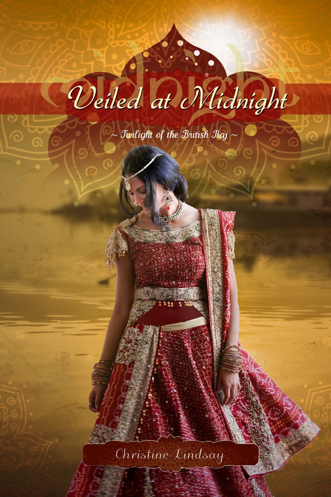
WhiteFire’s first series to be contracted and completed just got its final cover. The Twilight of the British Raj has won some awards and garnered a lot of very well-deserved praise. And when Christine Lindsay (the author) and I started chatting covers for the final installment, Veiled at Midnight, I think we were both rubbing our hands together in delight.
The first book of the series took place in British India of 1919. It was one of WhiteFire’s first two titles other than mine, and at that point, I was not designing covers. We hired the amazing George of Tekeme Studios, and he blew us away with this fabulous cover for Shadowed in Silk.
By the time book 2, Captured by Moonlight, rolled around, I had wet my feet in the design world, and Christine and I discussed it and agreed I’d try my hand at mimicking the style of the first with the images we had in mind for the second.
This third book jumps a generation. Set during the tumultuous partitioning of India and Pakistan in the 1940s, our hero and heroine are Cam, the little boy from the first book, and Dassah, who was a baby in the first book. I haven’t yet gotten my hands on the MS, but I know what an amazing writer Christine is, and I know we’re in for another sweeping saga of romance and suspense!
Christine started a Pinterest page for the book, which is where our idea-gathering began. She wanted gold on the cover, to represent the Joy of a new dawn. Though “midnight” is in the title (the Partition took effect at midnight), she wanted the images to represent a new day. (Not to mention we already had a night scene on cover 2…)
Our first thought was to use green and gold, to represent the Pakistan flag. The most compelling images we found were of a night sky, and my (very very very very very sloppy) playing around led to this.
Not bad. The lighting in that sky is amazing. But the original image of the model had her in a red sari, and changing red to gold is T-O-U-G-H. I managed a fair imitation with the low-resolution comp I downloaded from Shutterstock, but I knew it would be much harder with the real photo. So I was pretty happy when Christine emailed and said that her critique partner convinced her that red might be okay. It was a color Dassah had shied away from in the earlier part of the book, because it reminded her too much of all the blood that had been spilt. But they decided that later in the book, she could instead realize it also represented the blood of salvation.
So we began with this model picture from Shutterstock. We both loved the pose, and I especially loved the motion in the sari.
Obviously, next we take out the background.
Now, you’ll notice that in this traditional sari, the belly is showing. This is accurate, both today and historically, but we decided that for a CBA book, we probably shouldn’t have the bare flesh. So I inserted a semi-transparent layer to mimic sheer fabric there.
Now it was time for the background. There are some absolutely GORGEOUS images of India that we considered. I knew the characters spend some time at a mountain lake, and I knew we wanted gold tones, so I decided to try out this one.
Plopping Dassah in front of it, I got this.
A good start. I liked the colors together, and the water. But I wasn’t wild about how distinct that building is in the back. And Christine pointed out (later, but let’s show the change now, LOL), that the light is hitting her on the wrong side. So I flipped her.
To blur the background in the distance, but not the water up close–because I LOVE that reflection–I duplicated the layer, blurred the top one, and then applied a layer mask and faded the top image from the bottom of the screen upward–that way, the bottom layer comes through in its non-blurred glory toward the lower portion and fades into the blurred image at the top.
Pretty, yes? But not there yet. The covers for this series are rich with texture layers. So to get the full effect and really see if it was going to give me the look I was going for, I first added in the elements that would stay the same as the first books (but with color changes)–the one I call “the lotus thingy” and the “banner thingy” that goes behind the title.
Oo, I was starting to like how this was coming together! I went ahead and added the title. Which, for these books, includes the title itself, then the last word faded out behind it in an exotic looking font.
Okay, so now I had a great base. I loved where it was going, I loved the way the red and the gold worked together. But now I needed to add some texture.
In the first cover, Tekeme had used a flower overlay that I liked but couldn’t match exactly. So for book 2, I used a paisley design. For this one, I wanted something altogether different. So I did a search for “photoshop texture lotus gold” (don’t you love the random words you can put together for searches? LOL) and I found this one.
It just felt promising from the get-go, LOL. So I plopped it down on the top, set the layer opacity way down, and used my fade-out gradient to make the middle of the layer completely transparent.
Oh my. Yes. This was the point where my breath got all knotted up in my throat, and I knew I’d found my look. I went ahead and added the layer with Christine’s name, making it red. But that layer is also always textured, so I duplicated my texture layer, shrank it down, and this time didn’t fade it out. The result was this, and I gotta say, silly as it is, that’s it’s one of my favorite elements on this whole cover, LOL.
So I added that, and also the series name where it belonged. And I was happy. Almost. Mostly.
There was just one thing missing–a border. Each of the other two covers have a border, just a slightly-darker version of itself. I needed something like that here, but I didn’t want to mess with what I had already, so I nearly left it off.
Then I looked at the original texture layer again. And I noticed that it had really cool sides that were not on my cover because I wanted the lotus part to extend off in both directions. How to get those on as the border, without interfering with the nice transparency of the original texture layer? Well, I fiddled with it until I figured out the obvious answer. I pasted it on, narrowed it to fit the width of the book, and then deleted everything accept that border part that I wanted. And voila!
And there we have it. The real, honest-to-goodness finished version of the front. (Haven’t created the back yet.) I was fairly giddy with it, so showed it to hubby/publisher David, who said, “Wow. Yeah. That’s it.”
So I emailed it to Christine, who said, “CAN I SHOW THIS OFF?” 😉
I emailed it to best friend/crit partner Stephanie, who said, “I think this might be my favorite of all your designs!”
I don’t pick favorites, LOL. But I do adore this cover. I like the continuity with the other books in the series, but I also like where it’s different. I feel like this one was somehow more my design and less trying to mimic that first cover. And I just adore those colors together. So overall, we’re all very pleased. =) The Twilight of the British Raj will finish up in style!

by Roseanna White | Jan 8, 2014 | Books, Cover Designs, Remember When Wednesdays
~*~
Last week I was in a designing groove, so had some fun with the next WhiteFire historical, due to release in May. Sweet Mountain Music is a really fun story set in the Pacific Northwest in the 1890s. Chloe Williston is determined to make a name for herself as a journalist and earn her father’s respect–and thinks the way to do it is to tag along on a handsome naturalist’s expedition. His search–for the legendary Great North American ape (a.k.a. Sasquatch or Bigfoot).
In a time when gorillas had just recently been discovered in Africa, the idea of a giant ape in North America was downright reasonable, and I just love the comical voice author Suzie Johnson employs as she combines history and romance with whimsy.
But here was my challenge as a designer–how do I capture the allure of the adventure but also convey the historical era? How do I make it look fun and compelling without crossing over into silly? And how in the world was I to find a model that would let me accomplish all this???
Well, I’d been browsing the stock image sites for a few months, trying various search options until I finally found a model that looked promising.
She has the right look for Chloe–honey brown hair, the old books in her arms are great. But I wanted a bit more quirk. And blue eyes. And the costume sure isn’t right–the shirt could pass, but that skirt is way too slim.
And Suzie specifically requested a pith helmet. So.
I took a public domain photo of this bustle-era dress:
and copied the bustle part onto Chloe. I tilted her head a bit to give her a more playful look, and also added a helmet.
The result was this model:
Definitely the look I was going for–I loved the contrast of the helmet that screamed “Victorian adventure!” with the bustle. The books speak to her ambitions, but also add to the contrast.
Next came the background. I toyed with quite a few before my hubby said, “You need something green. Somewhere where Bigfoot could be hiding.” So I searched for leafy pictures of the Cascade range, and this one really worked with my model picture.
Plugged it in behind her, adjusted some lighting, a layer for texture,
and voila. I did the usual dance while trying to find the perfect fonts and frame to offset the title, played with positioning etc. I landed on a combination I liked after just a bit of trial and error.
I just needed one more thing. Purely for fun. =) Something to harken back to that Sasquatch search. Something…something like this.
Nowhere too noticable, mind you. Sasquatch is a hard fella to find, after all. But I bet you can spot it. 😉 Here’s the final front cover.
I have to admit, I loved it as soon as it came together–it felt like “it” to me. So I sent it to Suzie, who agreed that it captured all the elements we wanted to capture. She loved it too, so there we go! The final cover!
While I was at it, I went ahead and built the full cover too. Back copy may yet be tweaked, and that endorsement is obviously a place holder, LOL.
Overall, I gotta say I love how this one turned out–which is all the better because it had me stumped for so long. But you know, for two days’ work, this was a lot of fun. Bring on the next, WhiteFire! 😉

by Roseanna White | Dec 18, 2013 | Remember When Wednesdays, Uncategorized
Over these last few years, I’ve researched Christmas in Victorian times, in Colonial times, in the 20s. I’ve discovered how the Puritans banned it in New England, and how if you had a party in Maryland in the 1780s, the newspaper would publish when it was going to be, and strangers might just show up at your door. I’ve tracked some of the traditions through the ages, like hiding a pickle in your tree and wassailing. I’ve posted about the 12 Days of Christmas and how they actually begin on Christmas Day and end on the Epiphany (January 6).
All so much fun to learn about! Writing historicals has really opened my eyes to how our celebrations and traditions evolve through the ages, and how some pieces stay the same. Interestingly, we rarely know why we cling to some of the things that have stuck around for centuries, like mistletoe and yule logs.
And yet here I sit this morning going, What can I write about today? LOL. It feels like I’ve covered it all since I started blogging all those years ago. I’m sure I haven’t. But I apparently haven’t had enough coffee to make me think otherwise. So I thought I’d take a different course today.
One thing I love about all these celebrations I’ve learned is the thought that the traditions can bring the generations–the centuries, even–together. And sometimes I pause and wonder what our children will remember most. What are our Christmas traditions today, as a culture? Santa Claus? Christmas Eve candlelight services? Trimming the tree? Baking cookies?
 |
| Our tree and stockings |
Christmas has been a busy season for a lot of years, and though we today might think we’re busier than any generation before (and while we might be right), some of my favorite traditions are the ones that are pretty simple.
Singing Christmas songs.
Decorating the tree with my kids.
Brunch on Christmas morning with my family.
I love watching the delight on my kids’ faces as we bake or wrap or trim…and I love learning that back in Colonial days, Christmas really wasn’t for the kids like it is now. They received the same token gifts that parents would also give to servants–sweets, fruit, maybe a book or small toy. They weren’t invited to the parties. They were kept quiet in their rooms during much of the celebrating. Gotta say, I like having them involved. =)
What are some of your favorite traditions in your family? What are some that you’ve heard about that baffled or delighted you? Anything new you’re trying this year?


 Roseanna M. White is a bestselling, Christy Award winning author who has long claimed that words are the air she breathes. Having successfully launched two homeschool grads, she now spends her time writing fiction, designing book covers, and pretending her house will clean itself. Roseanna is the author of a slew of historical novels that span several continents and thousands of years, as well as a fantasy series and contemporary mysteries and romances. Spies and war and mayhem always seem to find their way into her books…to offset her real life, which is blessedly ordinary.